Favorite editing tools for street photography
I admit it, I take too many photos. I know it, and I have too many images to deal with, and unless I am getting paid to finish them and send them out to a client, they may never get processed. Are you in the same boat? Do you too have some images that have just been sitting there in your digital desk drawer?
With digital photography, and especially because of how cheap memory is (don’t forget to include web hosting sights and the cloud), more and more photos are just there and never used. The best solution is to be more decisive, and just take fewer photos. But we all get out of hand, and sometimes just come home with more images than we know what to do with.
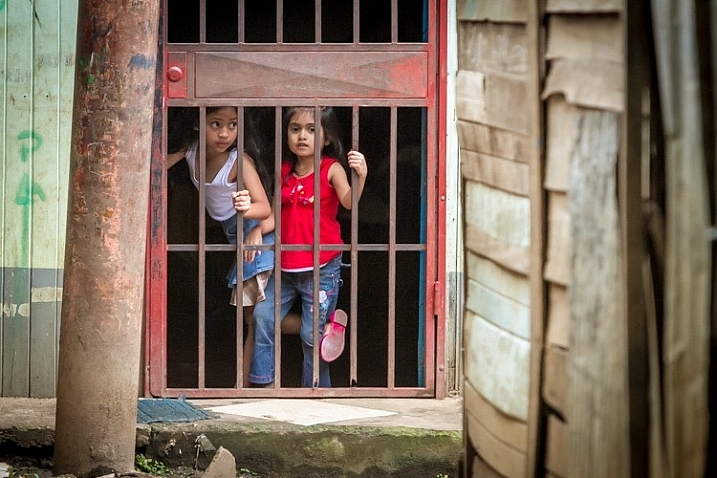
Final product after the simple steps followed below—a workflow that you can adjust to your own tastes too!
So the best thing to do is get to the grind and produce something. But it doesn’t need to be so much of a grindstone as you might think. I love taking photos more than processing and unless I am flying solo, I think I’ve got lots of people onboard with me. As you know, photography is not about broad strokes, and details are important. This set of instructions is specifically designed for street photography. But, are most of your photos from your travels? Well, streets (along with the convenient airplane) is maybe how you got there. Much of what we do as photographers crosses over into different genres of style and art. So have a go at the following tutorial, and you may find that with your own adjustments this is a recipe for more than just the street.
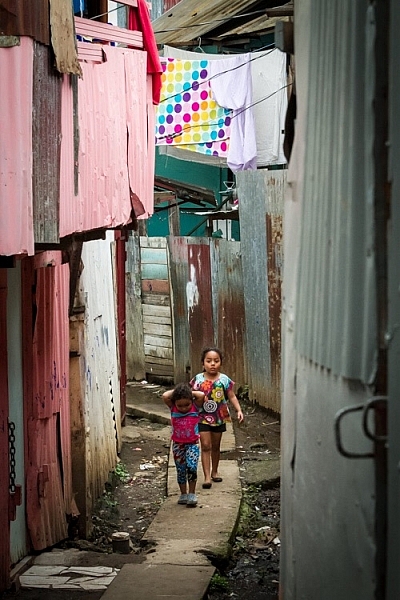
Final image of two young girls walking in the slums of San Jose Costa Rica, all editing was done following the steps below.
These instructions begin in the Library module of Lightroom, and then progress into the Develop module. There are countless modifications that can be made upon importing, categorizing them, giving them tags, etc. As the point of this tutorial is to streamline your workflow, the tips for editing will also be streamlined. So let’s get at it!
Library Module
Step 1 – Select images
Select a batch of images that are preferably in similar lighting conditions, and which have a similar theme. For example, choose a set of photos that were all shot outside over the course of a few hours, but not all night. Or a group of photos that were all shot in the rain. Lighting and theme conditions can vary, but greater variations will have potential greater variations in results.
Step 2 – White Balance
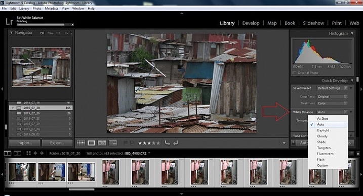
In the Quick Develop Panel (at the top of the right panel in the Library Module) Select White Balance and choose Auto. Before you turn away, let me assure you that there have been more Ph.D.s awarded, and dissertations given, in creating the algorithms behind this button. If you compound the interest in dollars that has been invested in this Auto algorithm it would sustain many third and fourth quarter GDP figures for entire nations.
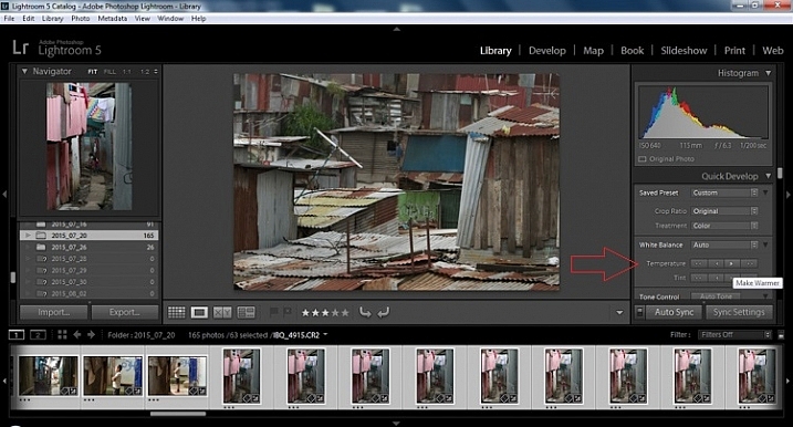
Step 3 – Warm images
Next, push the single arrow pointing right under the temperature heading indicated by the Make Warmer hint that appears if you hover over it. The single arrow will increase your warmth tone by +5. If you want plus +10 push it twice, using the double arrow will increase it in increments of +15.
Step 4 – Auto Tone
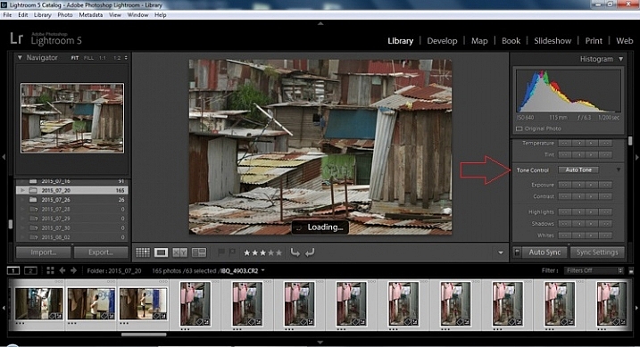
I know it is scary, and it does make me cringe sometimes too, but anything can be shifted, tweaked, and tuned later (and should be) to your liking. This will Auto Tone your exposure, highlights, shadows, whites, and blacks to each photo individually, so it is not the same as batch editing which will be covered later.
Step 5 – Decrease exposure
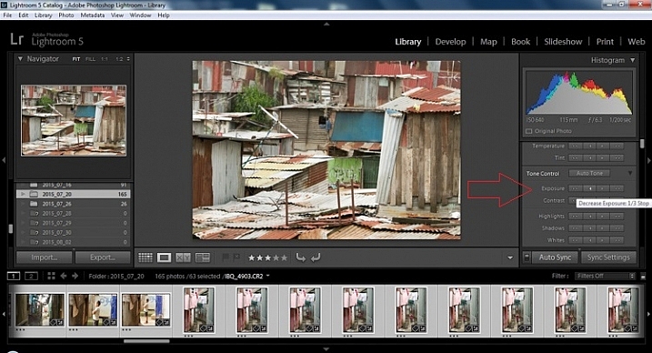
Select the single arrow to the left, decreasing the exposure by a 1/3 of a stop. It is minor, but keeps your darker tones (especially things like black asphalt) a little darker. Note: this is assuming you have a correct exposure to begin with – if it’s a bit out you can adjust later on a per image basis as needed.
Step 6 – Decrease Highlights
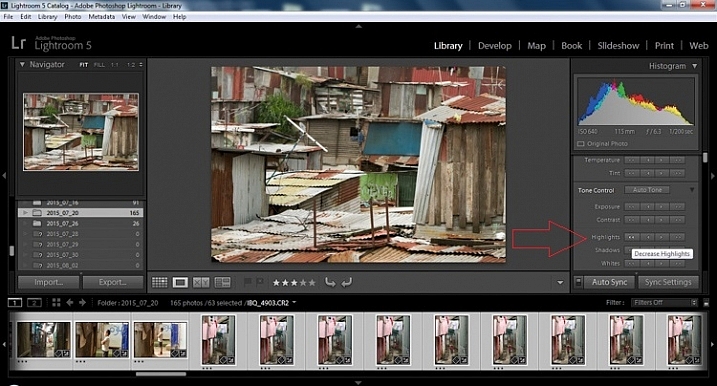
For the Highlights, use the double arrow to the left, decreasing the highlights, and select it once. Be patient, as depending on how many pictures you select and your computer speed, it may take more than a few seconds. This can be monitored by looking in the top left of the screen above the Navigator window (progress bar).
Step 7 – Shadows
For the shadows, use the double arrow on the right, decreasing the shadows, and click it once.
Step 8 – Whites and Blacks
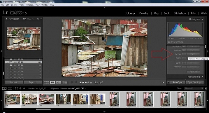
Increase the white clipping by +5, by clicking the single right arrow once. Decrease the black clipping by -5 by clicking the single left arrow once.
Step 9 – Clarity
Increase the clarity by +20, by pressing the double arrow to the right once (for more information about clarity please look near the end of the article which describes it in more detail).
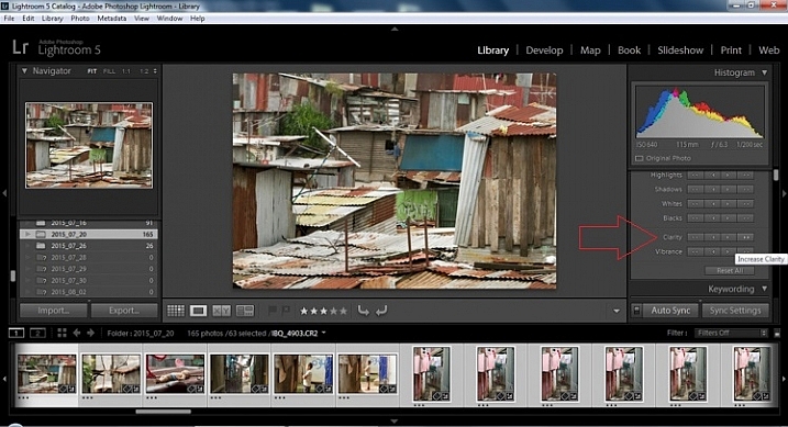
Step 10 – Vibrance
The final step in the Library module is to increase the vibrance by pressing the double arrow to the right (for more detailed information about vibrance please see below).
Develop Module
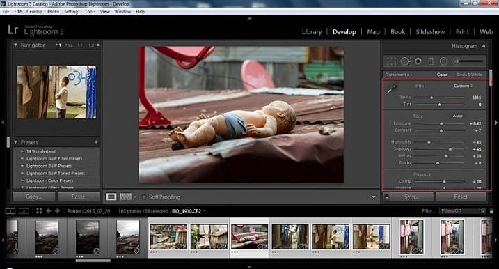
Now we will be moving into the Develop module. To this point, all the changes that you’ve made, have been applied to all the photos in the group, which you originally selected. Looking at the image below, you can see that despite the simple clicks made in the Library module, many delicate changes have been made. Again, all of these changes can be fine-tuned to your liking later. There are hundreds of modifications that can be made, but let’s keep those for later.
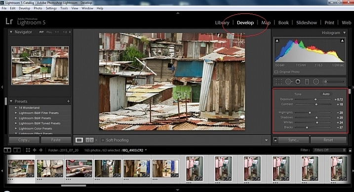
Notice the sliders have moved based on the changes you made in the Library Module Quick Develop panel.
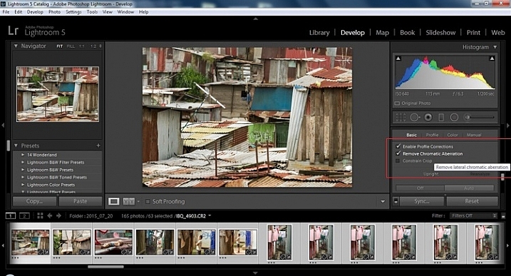
Step 11 – Lens Corrections
This step requires you to scroll down to the Lens Corrections Panel, and select two checkboxes. The first is Enable Profile Corrections, and the second is Remove Chromatic Aberrations. Both of these will allow Lightroom to make changes to the photo based on the lens used, and the inherent flaws that exist in that lens. A variety of corrections may or may not be included like, barrel distortion, vignetting, and as the second suggests, green and purple colors that result from diffraction in the lens.
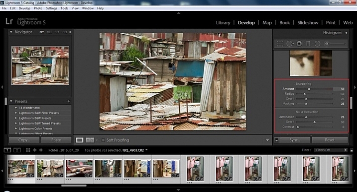
Step 12 – Detail Panel
Next is to scroll up and go to sharpening, increase it to +50, then increase your masking to +25. Finally you may or may not need to reduce noise. For this example, because the ISO was 640 the noise reduction was increased to +25. To understand, sharpening and masking in more detail and their relationship to noise reduction please read below.
Are you still with me? Here is where you will thank some of those computer science majors for creating the AUTO button. This is why they get the big bucks, and it saves us large amounts of time. We don’t need to apply these changes individually.
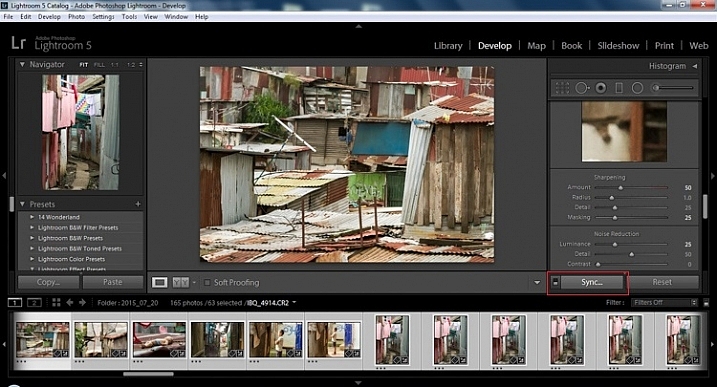
Step 13 – Sync settings
At the bottom of the Develop module there is a rectangular button that says Sync. PUSH IT! Make sure all your images are still selected before you sync (highlighted in the thumbnail strip at the bottom).
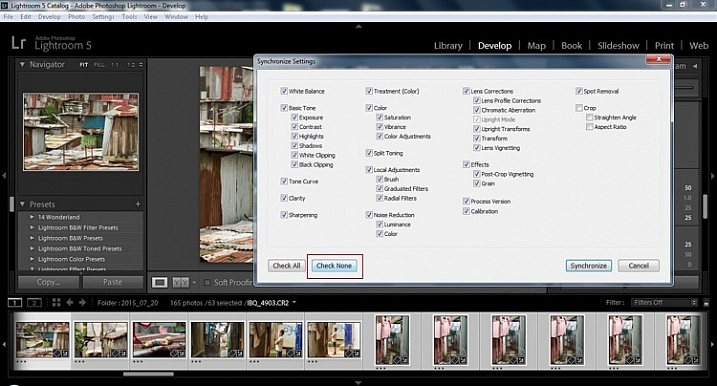
When the Synchronize Setting window pops up, select Check None. This will ensure that no unwanted changes will be made to your previous adjustments.
Now check the boxes labeled Sharpening, Noise reduction (which will subsequently select both boxes below it), Lens Profile Corrections, Chromatic Aberration, and finally Process Version. Notice these are the same adjustments that you had made in steps 12 and 13.
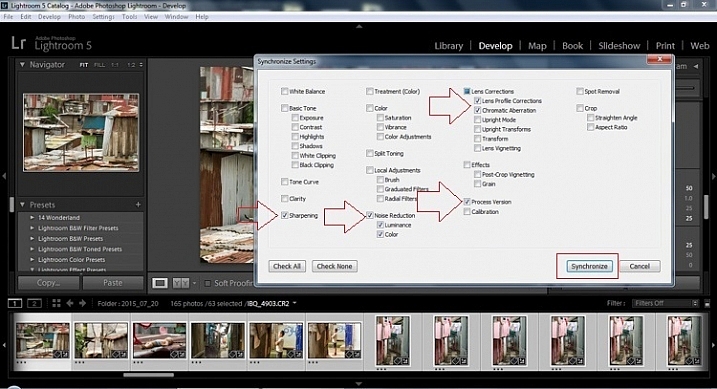
Finally, press the “Synchronize” button.
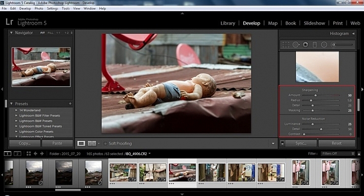
Looking at the screenshot above, you can see that the all of the selected photos have had the changes made to them. If I were to go back and make all the individual changes to the potentially tens, hundreds, or even in bizarre cases thousands of photos, it would have taken me time that I don’t have, and neither do you. Looking at the image below you can see that the exposure, shadows, lights, whites and blacks have remained unique to the individual photo.
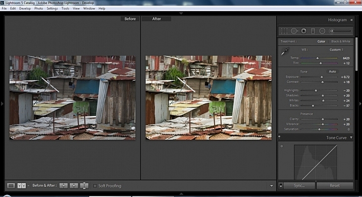
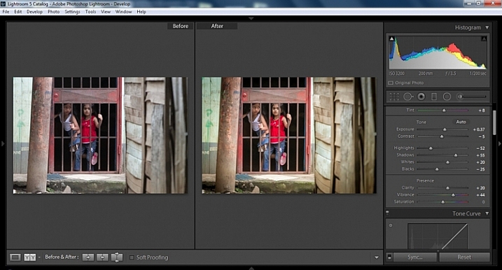
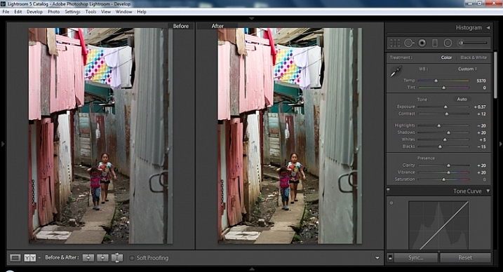
Below are simple side by side comparisons. In the last one I actually made a few additional small adjustments, and added a -10 vignette. Other than that, it is ready for export, along with almost all of the other photos that were just individually and batch adjusted. It is a bit of mix and match magic that keeps your photos natural, and true to the street.
Clarity
Clarity increases the contrast where two different tonal values meet. It is like contrast but on a micro scale, makes the image seem to be sharper. The lights will get lighter and the darks darker, but only where the different tone values meet, not broadly across the whole tonal range of the image.
Vibrance
Vibrance increases the tone of colors that are not already saturated. It is like a balancing scale for color. Saturation on the other hand, increases the intensity of all spectrums of light. Thus, vibrancy helps to bring out subtleties in the colors. For street photography, it brings out richness, without creating an over-saturated look. Sometimes I pull the vibrance up, and push the saturation down, to maintain an urban feel but doing so without making it look over-worked.
Sharpness
Just as I said, clarity is like contrast on the micro scale, sharpness is like clarity on a micro scale. Thus, it is like micro-micro scale. So we are still dealing with tonal values, but in even more detail. So be careful how much you increase your sharpness. Never try to rescue camera shake or blur in the photo using sharpness. “The devil is in the detail,” and this is no truer than in the sharpness slider. Because what you gain in sharpness you also increase the amount of noise (not desirable). If you have a high ISO, sharpness is more of an enemy than a friend.

Final image all adjustments applied
Masking
Textures will become more enhanced, but smooth surfaces will not be affected, resulting in less excess noise being introduced. This will help the street photography mood, without giving it an overly grainy feeling, or your shadows having too much noise. So how much of this movement left and right on the Masking slider is helping or hurting all your hard work? Thanks to those “AUTO guys” the Alt key on windows (Opt on Mac) will give you a grayscale impression of exactly where, and how the sharpening is impacting your photo. White indicates the area on the photo where sharpening is being applied, and black shows where it is not. You will notice that the contrasts and textures deserve most of the sharpening, alleviating your smooth tones and surfaces from the ill effects of sharpness.
Summary
So hopefully that will give you some things to try out with your images to process your street photography faster and consistently. Do you have any other tricks and tips you use? Please share in the comments below.
The post 13 Steps for Editing Street Photography in Lightroom from Start to Finish by Branson Quenzer appeared first on Digital Photography School.