Lightroom is kind of like a Swiss Army Knife or, better yet, a Leatherman Wave, in that it does so many things and is an invaluable program for many photographers–amateur, professional, or anywhere in between. Regardless of whether you’re the kind of person who prefers presets, or someone who likes scooting sliders, there are four options hidden in plain sight, right on the Basic panel of the Develop module, that can dramatically enhance almost any picture.
It took me a few years to learn to use these sliders properly, and even now I am still figuring out new ways to work with them, in combination with other options in the Develop module to get my pictures looking just the way I want. But, now I am at a point where adjusting these four options is the very first thing I do on almost every single photo. They’re that useful for me, and could be for you too.
The four key Lightroom sliders are:
- Highlights
- Shadows
- Whites
- Blacks
Learning how to work with these four key sliders can have an amazing impact on your photography.
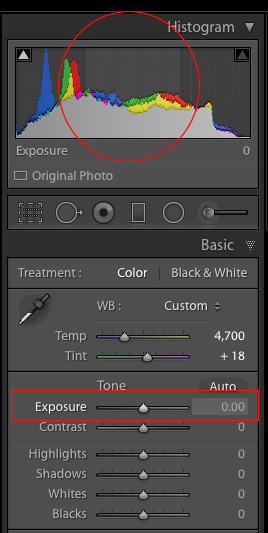 To demonstrate the effect of each slider I’m going to show you a picture in various states of editing, as I adjust values for each option one by one. If you are used to using the Exposure (note in the screenshot on the right what areas of your image are affected by moving the Exposure slider) and Contrast sliders to adjust your images, you may want to put those aside for now and focus on these other four instead, as they can give you significantly better results.
I should also note that, as with virtually all Lightroom tips and tricks, your results will be best if you shoot in RAW instead of JPG. The picture I’m going to start with is a shot of some colorful leaves on a rainy day, that seems fairly decent to begin with, but is made much more vibrant and richer just by adjusting these four key Lightroom sliders: Highlights, Shadows, Whites, and Blacks.
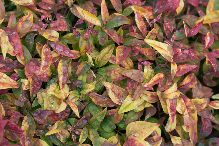
The original photo straight out of the camera with no adjustments applied whatsoever.
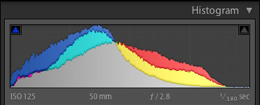
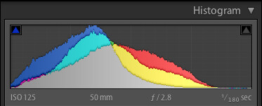
Histogram of original unedited image.
#1 – Highlights slider
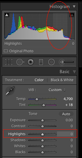 I mentioned the Exposure slider in the previous paragraph, which is a tool that adjusts the overall brightness or darkness of an entire image (based on the midtones). The Highlights slider allows you to perform a similar type of adjustment, but only with the brightest parts of an image (tones not quite pure white). Moving it to the left will make the brightest parts darker, and moving it to the right will make the same parts brighter. Hover over the Highlights slider with your mouse to see on the histogram which parts of the image will be affected (see screenshot at the right).
I use this as a starting point when making adjustments to a picture, because it can help recover some of the details in the lighter parts of an image that might seem a bit too bright or washed out, and can give the picture a more evenly-lit appearance overall.
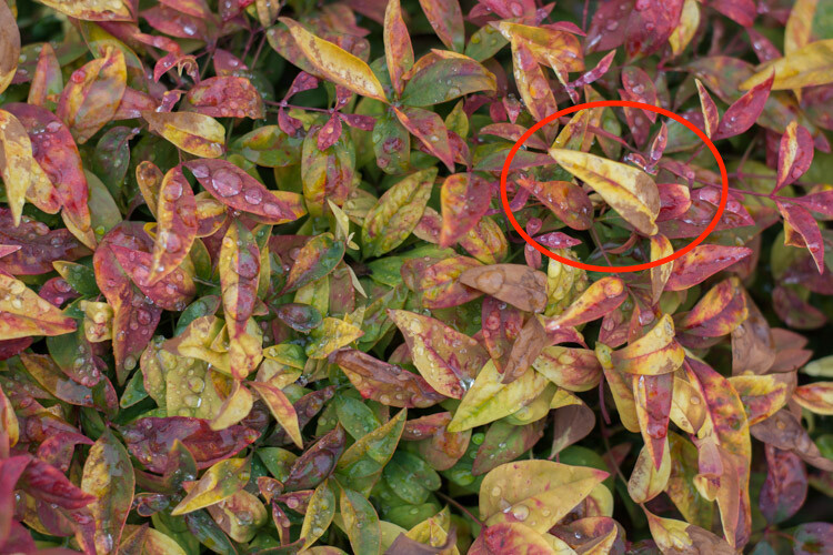
Highlights adjusted to a value of -80. Notice how the yellow leaves, particularly the large one on the right-hand side, now display a much richer shade of yellow and are not as washed-out as in the initial photo.
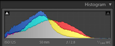
Histogram with highlights adjusted.
As you adjust the Highlights, or any of the other three sliders mentioned in this article, you can use the built-in clipping guide to help get the right amount of adjustments to your image. Hold down the alt key (option on Mac) as you move the slider from left to right and you will see your image go all dark except for a few spots. These spots indicate areas of your image that are clipped, which means image data is being lost in those parts. You generally want to avoid clipping, so it’s a good idea to not adjust the Highlights or any other slider so much that you start seeing lots of clipped areas.
A peek at the histogram on top of the Basic module will show you similar information, as the more you adjust the Highlights slider to the right the more you will see the colors move to the right-hand side as well. If they move so far that they are off that side of the grid, areas of your image are being clipped, and there are going to be spots of pure white that you may not want.
#2 – Shadows slider
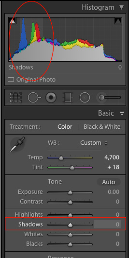 In a similar vein as the Highlights slider, the Shadows option makes the dark parts of your image a little brighter (see image right for which areas are affected). It’s kind of like using the Exposure slider to make your image brighter, but restricting it only to the sections of an image that are very dark, while ignoring the rest. This works wonders on pictures that are underexposed, as modern cameras have image sensors that capture an amazing amount of detail in the shadows, particularly at lower ISO values. It’s rare that you will need to (or even want to) boost the shadow level clear up to 100, but it’s nice knowing Lightroom at least gives you the option of doing so.
I should also note that you could use the same slider to make the shadow areas of an image even darker, and depending on the type of photography you do, that may very well be a useful option but most photographers will want to just lighten the shadows instead.
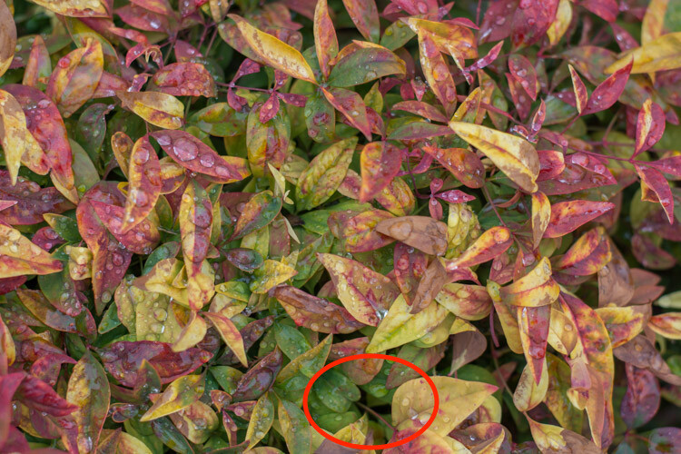
Adjusting the shadows by +50 helped to bring back some of the detail that was lost in the darker areas, as you can see in the area of green leaves inside the circle.
Highlights and shadows adjusted.
#3 – Whites slider
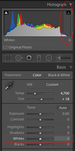 This is related to the highlights, but has a slightly different impact on your image, that is subtle but quite impactful. Adjusting this to the right essentially makes the white tones in your image, more pure white. It affects all the white tones in the photo (see image on the right) as opposed to the highlights slider which only deals with a narrow range of very bright colors.
What you’re doing here is setting the white point, or telling Lightroom what you want the brightest point of your photo to actually be. This can give a flat image much more depth and tonality, and take an otherwise boring picture and really start to make it shine. I almost always drag this slider a little bit to the right, though you must be careful not to let anything get clipped, which you can do by holding down the alt or option key while you drag it.
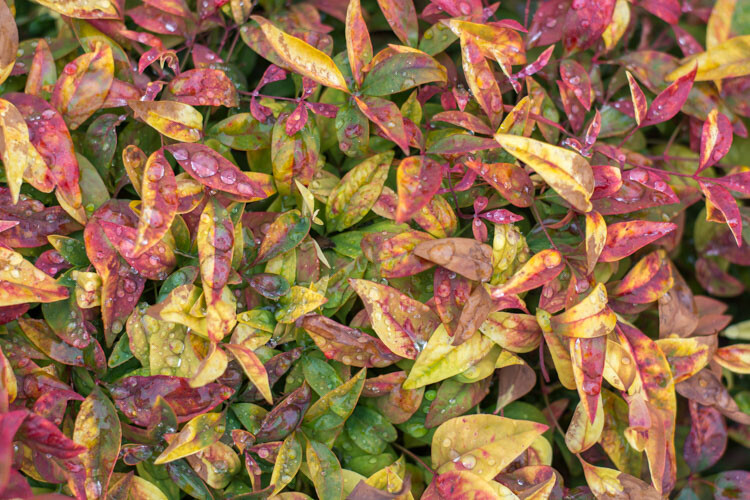
Bringing the white slider to a value of +45 now makes all the white areas more pure white. The effect is most noticeable on the various water drops which now appear much more vibrant and well defined.
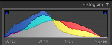
Highlights, shadows and whites adjusted.
#4 – Blacks slider
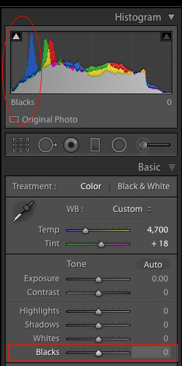 Similar to the Whites slider, this one adjusts the black point of your image, or how dark the darkest portions really render. I almost always slide this to the left to give my photos a little more punch. It helps pictures have a little more contrast, while bringing out a lot more color in any image as a whole.
One difference to note when adjusting this slider, as opposed to some of the others, is that you actually do want the black level to be clipped slightly. So, when you hold the alt or option key down as you adjust this one, you want to see a few highlighted areas show up. The reason for this is to make the very darkest parts of your images truly black, which adds depth and a nice pleasing look to your pictures, that is far more effective than simply moving the contrast slider.
Note: the contrast slider pushes out from the middle of the histogram, whereas pulling the Whites and Blacks sliders pulls out from the edge – thus giving you more control over how contrast is applied to your image.
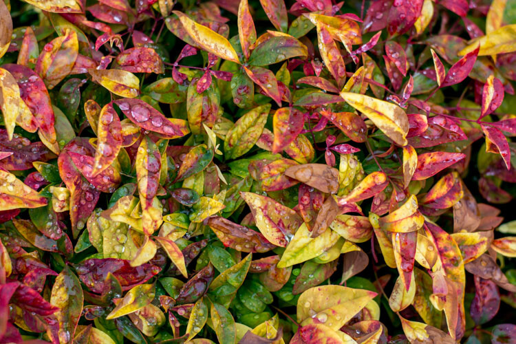
Bringing the Blacks down to -70 makes the black areas pure black, and gives a much richer sense of contrast to the image overall than simply adjusting the contrast slider.
All four adjustments made.
Before and after
To give you a clear sense of just how much these four sliders can affect an image, here’s a before and after comparison of the same photo. The original seems so dull and lifeless, compared to the vibrant dynamic edited version. Remember, the only things that were adjusted were the Highlights, Shadows, Whites, and Blacks sliders.
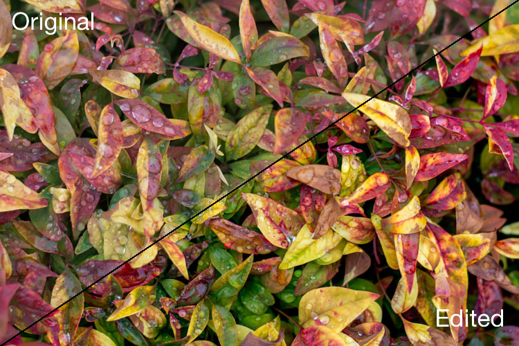
There are dozens of other edits that can be done in Lightroom to improve photos. Simple things like increasing the clarity, adjusting the tone curve, fine-tuning the sharpening, or selectively editing each color, can improve your original images (especially if you shoot in RAW) leaps and bounds beyond what you might have thought. But if all that seems like a bit too much to take in all at once, just know that you can get a huge amount of improvements just by using these four simple sliders in the Basic panel.
When I said that these four key Lightroom sliders can supercharge your editing, I really meant it. Learning to use them only takes a few minutes, and can make a huge difference in your images.
To recap, here’s what each slider does in a nutshell:
- Highlights: Adjusts the brighter portions of an image to bring back some color that might be too washed out.
- Shadows: Adjusts the darker portions of an image to bring out some color and detail where it may appear to be too dark.
- Whites: Makes the whitest portions of an image more pure white.
- Blacks: Makes the blackest portions of an image more pure black.
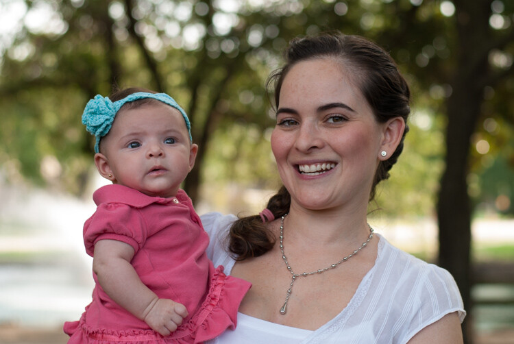
Original image, straight out of camera, with no edits applied.
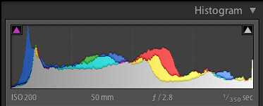
Original image histogram.
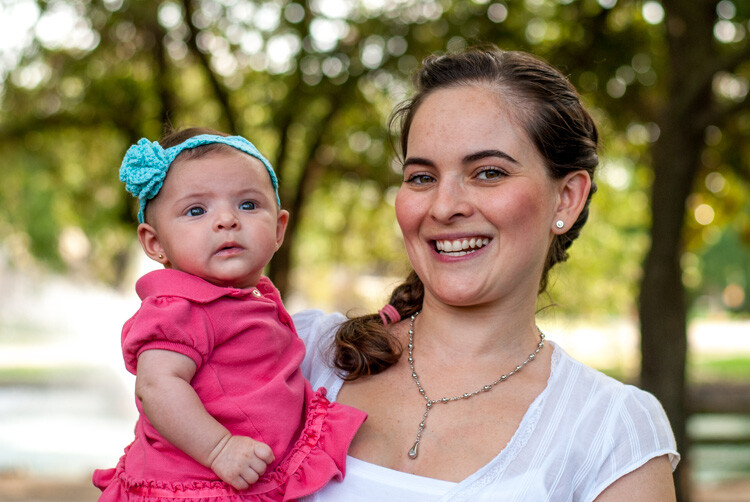
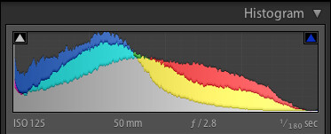
Highlights -47, Shadows +83, Whites +79, Blacks -56, and no other edits at all.
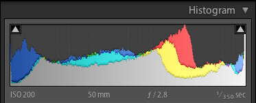
Adjusted histogram.
I have found myself using these four sliders so much that I actually created a custom preset in Lightroom that sets them all to specific values. I often apply this preset to every picture upon import, as it gives me a good starting point to work from, when doing my other edits. The values I use are: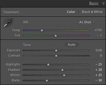
- Highlights -25
- Shadows +20
- Whites +25
- Blacks -30
Your mileage will vary, and again this is just a starting point, but hopefully all of this illustrates just how useful these four sliders are. When I first started working with Lightroom I was so overwhelmed with all the options at my disposal, that not only did I think I would never be able to learn it, but I didn’t even know where to start. If that sounds like you, I would recommend giving these four sliders a try and use this as the springboard for the rest of your edits.
What about you? What are some of your favorite editing tips and tricks in Lightroom? Do you have a particular key to an effective workflow that you’d like to share? Leave your thoughts in the comments below.
The post 4 Key Lightroom Sliders That Will Supercharge Your Photos by Simon Ringsmuth appeared first on Digital Photography School.