For a limited time only at Snapndeals, May 10-24th only get 33% OFF Timeless Portraits & Natural Light Black & White Portraiture, a 2-eBook Bundle by Wayne Radford.
Pre-visualizing is an art form, that I believe, is not taught enough these days. It is the foundation for an artist or photographer to establish lighting, background, foreground elements, composition, and harmony. You need to establish all this before lifting a camera to your eye. Let’s look at some techniques and tips for pre-visualizing.
1 – BACKGROUND
Are there any distracting elements behind the subject that draw your eye away, e.g., bright hotspots such as sun coming through trees, strong geometric shapes, or bright colours. If these are a problem, move the subject or camera position around to avoid or minimize their effect.
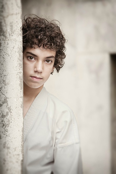
2 – FOREGROUND
Can you use any foreground elements to help create framing – examples would be rocks or foliage. Even getting down very low to blur the foreground will create a framing effect.
3 – COMPOSITION
Look around for shapes and perspectives that create more interest and lead your viewer around the scene. Example: I like to use the Golden Triangle instead of the Rule of Thirds, so I’m looking for elements that balance with that in mind. There is a sample below and you can read: Divine Composition With Fibonacci’s Ratio (The Rule of Thirds on Steroids) for more comprehensive information. Of course, it’s built-in as part of the cropping tools of Photoshop CS6 (and LR) and later, but I suggest learning to see this way before post-production adjustments.
4 – HARMONY
This one is the most overlooked aspects of composition. I want my subject’s face to stand out, so I generally choose backgrounds that are complimentary to their clothing for colour, and depth of tone for black and white. Also, try minimizing any additional colours in the background that clash with the subject. Yes it sounds complex, so I’ve added some study examples to make it easier. (clothing colour selection is also important, but that’s a subject of its own for another day). Next time you watch a movie, look at the colour coordination of clothing and scenes.
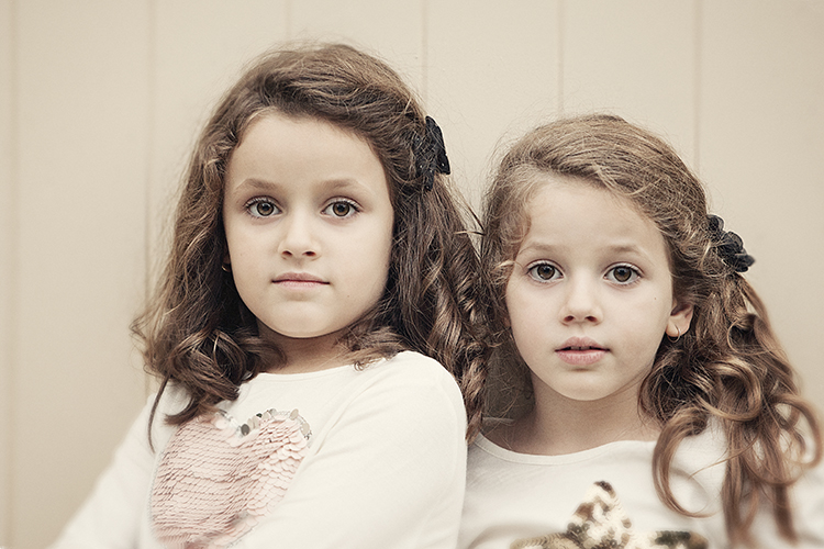
I chose an old painted door as the background for these two girls as it had the same hues (colour tones) as their clothing and skin. Look at your subject’s clothing colours, and then find a background tone that will compliment it. This will make them stand out from the background and not create a distracting colour contrast. An example would be if the background were green or blue.
The simpler, less cluttered backgrounds work best, especially when the colour tones harmonize. Keep the subject at least a meter or more away from the background, and use a wide aperture of f/1.2-2.8 to create a shallow depth of field.
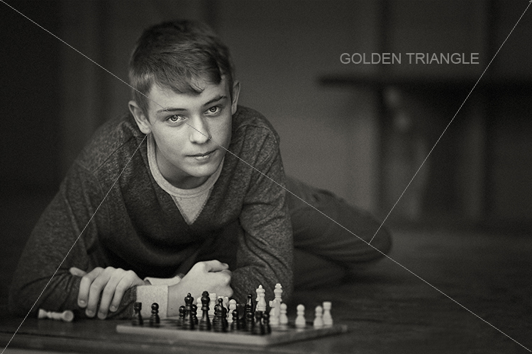
Be careful that the subject doesn’t blend into the background. In this study I first looked for the light direction, then looked at the background colour and tone. It was a yellow painted wall which normally would record brighter than his face, but as it was undercover in shade, it rendered quite dark. Looking at his clothing colours I knew that there would be separation that could be controlled in Photoshop without any problem, if necessary. Again distance from subject to background, combined with an f/2.8 aperture setting, creates a lot of background blur which allows the subject to pop. Note, there are no distracting background elements.
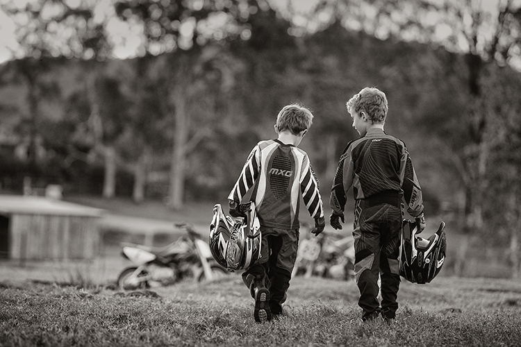
When searching for suitable locations, you may find lots of distracting objects and textures that will make your image busy. This is when pre-visualizing where the camera and subject should be placed, and what you want to be included in the background should be used.
In this image of the two boys, I noted that the trees and shed were too cluttered and distracting. By placing the boys a good distance from the shed and trees, and again setting the lens to create a shallow depth of field, (f/2.8 70-200mm lens) I was able to achieve good subject to background separation. The bikes were important to the story, so I placed them in the background to give the boys a direction to walk. Also, note the rim lighting on their hair gives extra separation.
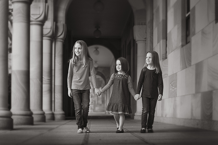
Pre- visualizing this scene is an easy one for a trained eye – find the light, look at the background. Here you can see the light wrapping around the columns, creating graduated shadows, and a diminishing background that gives depth to the overall image. In this study, the light is cross-lighting them at 90 degrees to their bodies, so turning their faces to the light creates modelling on their faces, which adds shape to their faces.
The background almost has a 3D look in the way it diminishes. Column over column, and arches layering over each other, creates great depth.
The following study is an example of how I try to pre-visualize a portrait session
When I found this beach location (below), I was overloaded with ideas on how I was going to use it. This is the opposite to writers block, where you become void of ideas. Instead, you can be over excited with creative ideas and forget the basics that make a portrait work.
The first consideration was the direction and quality of light. In this study the open sky (right hand side of the photo, over the ocean) was the main light. Note the sun was setting over a hill behind the children, so I am using the soft light provided by the open sky. While it is a fairly flat light and very soft, it provides enough cross lighting to enhance texture and shape in the clothing and rocks. Notice the small specular light, rim lighting her legs, and the shadows in her clothing. These are helpful indicators to the direction of light when it is flat.
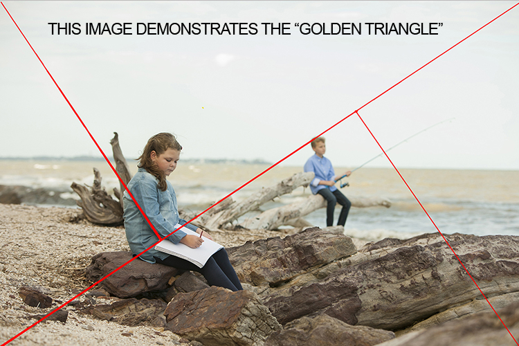
The next consideration is the placement of the subjects in relationship to the light, and the natural props such as the rocks and driftwood. Those props are the things that get photographers excited, the challenge is how to use them creatively. Remember this is all done before lifting the camera to your eye – the art of pre-visualizing. I also noticed the angular shape in the rocks curving towards the ocean, this matched the angle of the driftwood.
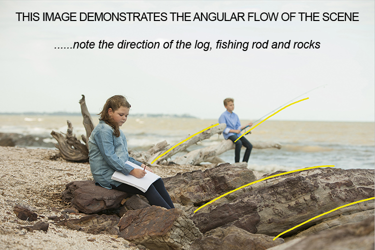
The girl was placed on the most distant rock (also the flattest one for comfort) so the light was coming from her front left-hand side, creating some modelling to her clothes and face. It also allowed the image to read from left to right.
The boy was placed on the driftwood, with his rod angled to match the driftwood branch beside him. It’s also a similar angle to the diagonal line running from top right to bottom left in the image. My only disappointment was the horizon line running through the girl’s head. It wasn’t possible to move the camera any lower, and raising the camera higher would have placed the boy’s head near the horizon line. Moving the girl wasn’t an option either due to the awkward shapes of the rocks. I was happy to leave it that way, as the shallow depth of field had created enough background blur to allow her to separate from the background.
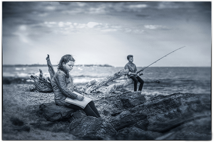
Canon 5D + 70-200 f/2.8 IS lens – F4 @1/800th – ISO 400
Hand-held at ground level
Photoshop CS6 – Alien Skin Exposure 7
When you learn the art of pre-visualizing, you will look at your work with greater satisfaction. You will know that you alone created the image to the best of your ability, using all the artistry skills of light and composition before even raising the camera to your eye. Not everything is created in the computer, I believe pre-visualizing is another tool in the journey of craftsmanship.
For a limited time only at Snapndeals, May 10-24th only get 33% OFF Timeless Portraits & Natural Light Black & White Portraiture, a 2-eBook Bundle by Wayne Radford.
The post 4 Tips for Pre-Visualizing – Look Before You Shoot by Wayne Radford appeared first on Digital Photography School.