On now at Snapsdeals is Wayne’s ebook: Portrait Tips and Techniques: Timeless Portraits. Sale ends December 8th (2015) get it now and save 20%.
These tips are a follow-up to my previous article about 6 Tips for Taking Better Natural Light Classic Portraits, and the process of creating simple posing and composition for outdoor portraits. To me, these things are what refines a portrait. You can have the perfect lighting conditions and location, but if the subject looks awkward or the composition is unbalanced, the image will fail aesthetically.
Each of these images will give you some tips and understanding of the creative process for creating outdoor portraits:
#1 – Creating back-view portraits
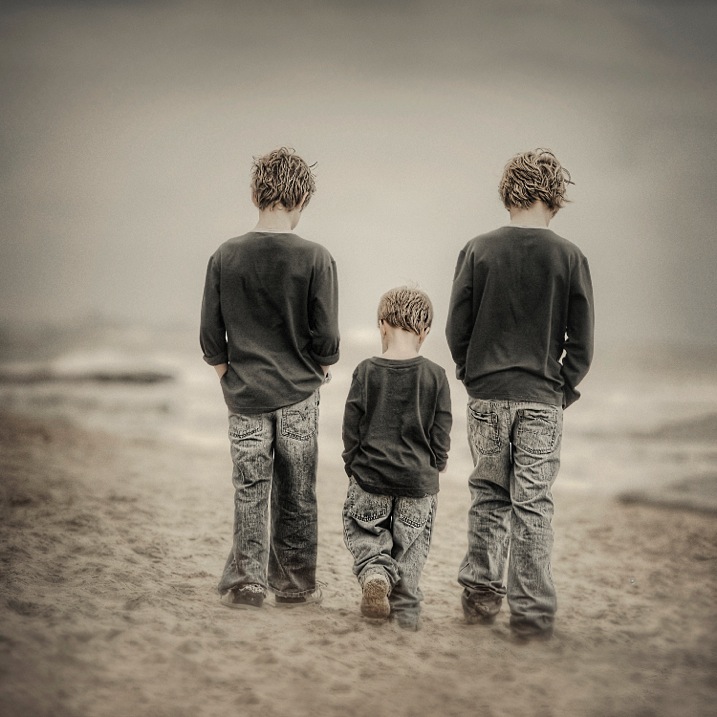
Creating interactive back-view portraits is fairly easy. In the portrait above I asked the two older boys to put their hands in their pockets, and start walking slowly in a specific direction. Of course the youngest one followed and mimicked his big brothers.
Ideally you want to get your subjects to talk to each other while walking and watch for the unexpected reactions. Getting them to talk about sports, school holidays or any interests they have, will make them more cooperative and loosen them up, making the portrait more natural looking.
I suggest you use continuous autofocus and a zoom lens for these types of portraits. This was taken with a 70-200mm lens at f/4. The original image of the three boys was the normal 3:2 rectangle, but in post production I decided on a square.
#2 – Interactive poses
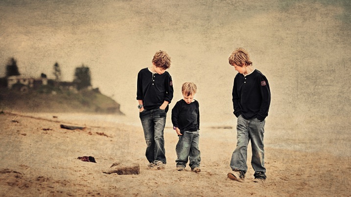
Same three boys in an interactive pose. I set this shot up like a movie director, by simply giving them some direction of what to do, then let them go, and recorded their reactions. Just letting them walk around and happy snapping doesn’t work for me. I prefer to place them in the scene I want, based on background and lighting, tell them what to do and then record their natural reactions.
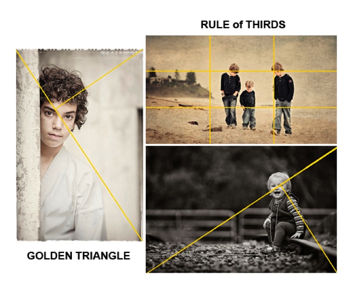
In this study I placed the boys away from the headland, so they were against the sky, and let them kick a piece of driftwood around. A ball would have been another option. The composition I used is the Rule of Thirds which can be seen at the bottom of this article.
When doing these types of environmental portraits, I suggest you create it like a landscape, then place the subjects into it.
#3 – Find the light and pose for the subject
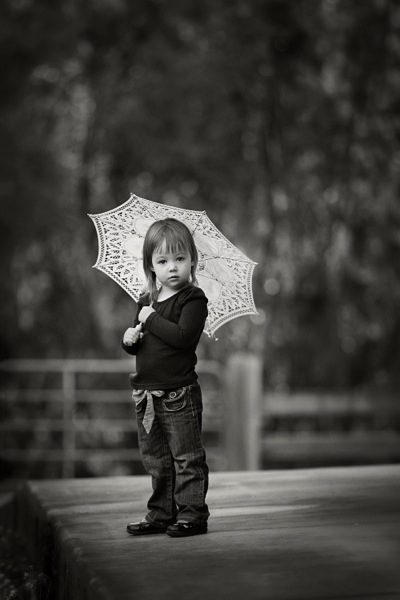
After establishing the location, background, and direction of light, I placed the the young girl near the edge of the path, her body turned away from the camera at approximately 45 degrees to the camera, her head turned back to camera.
There was a building to her left, which was subtracting light from the left hand side of her face. The umbrella was the client’s prop, which I decided to use. I felt that her hair would have blended into the background otherwise, but this way her head is framed by the contrast of the umbrella. I like the way she was holding on to the umbrella, it simplifies her hands from being a distraction.
If she had been older, I would have asked her to bend her front knee, therefore placing her weight on the back foot, creating an s-curve through her body. There was a temptation to place her to camera right, thereby in the RH third, but I chose the opposite side for a different look. No right or wrong reason, just my preference.
#4 – Connect people to each other and the background with posing
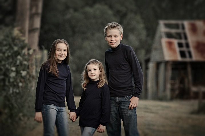
In the portrait of the children above, I wanted to place them between the old shed and the fence line, allowing their heads to appear against the soft muted tones of the out of focus trees. Having secondary backgrounds like the shed and fence against the distant background of trees can add extra depth, giving a more three dimensional look.
The pose is natural, with a small amount of refinement. I like the subjects to turn away from the camera, then look back, rather than shoulders square on to camera. Also by leaning the outside subjects to the centre, it creates more emotion through body language, which also creates a slightly more triangular composition (by luck matching the shed roofline).
The varying heights of the children allows each of them to have their own space. Often you will see heads in a row on the same plane. Note the simplicity of the hands, curled away from camera or in their pockets, not draped over the shoulders. Also with the two girls holding hands, and the youngest one leaning across towards her brother, it creates a connection within the group.
#5 – Match tones for high or low key portraits
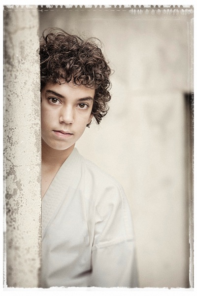
When creating high key or pastel portraits, it’s important to “key-in” the clothing colours to the background. For example: white against white, or cream against cream, or soft muted tones against other muted tones, NOT light on dark. The idea is to be drawn to the face, not the contrast between backgrounds.
This young boy (above) has great eyes, so we don’t want to be looking anywhere else but his face. His karate outfit is white, but for my artistic license, I changed it slightly to harmonize more with the background. In the black and white version for the client, I left it white.
The pose is simple, and he is square to camera, with his body and head leaning more to his left. His head is also tilted slightly down, which allows us to see the full roundness under his eyes. I find this pose more engaging for him. Composition is close to the Rule of Thirds but I do prefer the Golden Triangle. (See below)
#6 – Camera angle is important
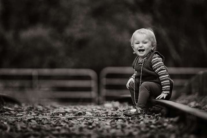
A low camera angle was selected for this portrait to bring the viewer down to the child’s level. Also by lowering the camera, this places her head above the gates in a neutral uncluttered area, allowing her face to stand out from the background. Another advantage is that the low angle causes the lens to blur the foreground so much, that it leads you directly to the sharp subject.
Again the subject is angled away from the camera and her head is turned back to camera. Her hands are naturally placed.
It’s very important to remember when posing children or adults, to turn the body and legs away from the camera to avoid unflattering crotch shots of all ages. If you don’t know how to pose hands, give a child something to hold, failing that, hide them as much as possible. Personally I recommend learning how to pose them to look natural, and then you will recognize when they’re not correct, and be able refine the pose.
Summary
- Avoid the body and face being posed in the same direction.
- Try keeping the face at about 45 degrees to the body as a starting point.
- When seated, avoid knees and feet/shoes pointing directly at the camera. Turn them away.
- Direct children to do natural things when creating interactive portraits such as talking to each other, kicking a ball, reading, etc. This will create realism.
- Always watch your background, and give your subjects their own space to avoid a busy image.
- Use hands to touch, and overlap bodies to create poses that have a connection between people. (E.g. the three kids above)
- Try to shape poses to replicate objects that may be in the composition.
- When possible, key-in clothing colours to harmonize or compliment background tones. (E.g. photo # 5)
- Select a low camera angle when photographing kids. Get down to their level or below.
- Use foreground blurring to make your subject pop. (E.g. photo #6)
- Use the Rule of Thirds or the Golden Mean as a starting point for improving your composition.
On now at Snapsdeals is Wayne’s ebook: Portrait Tips and Techniques: Timeless Portraits. Sale ends December 8th (2015) get it now and save 20%.
The post Tips for Creating Outdoor Portraits by Wayne Radford appeared first on Digital Photography School.