In this article, I will cover a core concept in photography that is neglected by a surprising amount of photographers. Photography is a wonderful mixture of science and art. The science part can be intriguing and is an important aspect but not the whole of it.
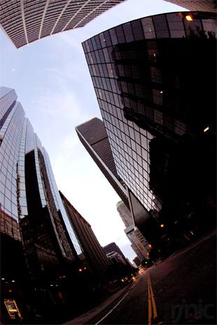
“downtownLA” captured by PictureSocial member rjnic
Techniques like depth-of-field control, slow shutter speed effects or motion freeze are all interesting but they only compliment one of the core concepts of photography which is closer to art: composition.
Composition
A photographer is an Artist and a dreadful fate of an artist is “predictability”.
And it is this area where we are all set apart from each other. We see things differently, perceive differently and of course think differently. Although biologically we are all human, all these contribute to the “uniqueness” of one person and hence to his/her creation in any field of art.
So am I saying only a specific people can become a photographer? Absolutely not. We, humans, have an excellent gift of learning. We learn by imitating, we learn by reading and collaborating through communication. Same applies to photography. We first have to imitate the best works from legendary photographers, try to “see through” their work, analyze it, appreciate it and follow it before we can innovate our own styles.
After going through a bunch of photography works from distinguished photographers like Ansel Adams, Edward Curtis and Irving Penn and many others… I noticed “few” patterns and commonalities that make their work extraordinary. And then after researching on internet and library books, I found there are a LOT of concepts and ideas behind those “few” patterns. Somehow the patterns were “deliberately” introduced to be noticed and CREATING new ideas for the rest of the photographers (like me) to learn and adore.
Here I am going to share some of my insights combining already available plethora of information on this topic while throwing in some of my examples in this engaging discussion of COMPOSITION: How to make a photo more “appealing” and “pleasing” to our eyes. Like good food is not a direct outcome of cooking in a good utensil, it’s the photographer’s decision that makes a photo great and hardly the camera itself. Of course you must know the technical part of taking the photo or you will land up ruining your best shot due to incorrect camera and flash settings.
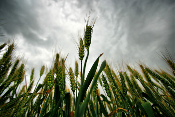
“viento2” captured by PictureSocial member Raluca Mateescu
This discussion is very subjective, slightly controversial but informative as well. Please understand, real artists are not confined into any set of rules. But I can guarantee you that they are MORE aware of these “rules” than us and thus are able to consciously take a superior decisions to either follow the rules or break them. So I would suggest that my tips are mere guidelines and are not meant to be followed diligently in EVERY situation.
Sounds kind of a disclaimer, huh… well it’s a message from a photographer to a photographer. Most of the time we THINK that we are limited by what is presented to us for taking photos, but little we REALIZE that it us who choose WHAT we photograph, in what ANGLE, from what POSITION. and WHEN we press the shutter, click!
Now let’s jump right in. For simplicity I have broken the material into four easy key elements to remember and understand and I will cover two of them in Part I of this article:
I. Choose the subject
Be a miser when choosing your subject. Do not try to include EVERYTHING you see in a SINGLE photo. I got a great advice from one my photographer friend that I am going to share with you –
While Painting a picture we start from a blank canvas and “add” objects and colors on it to produce a finished painting. With Photography, we start with a scene already full of objects and colors and we consciously “eliminate” unwanted distractions and focus on a subject resulting in a good photograph.
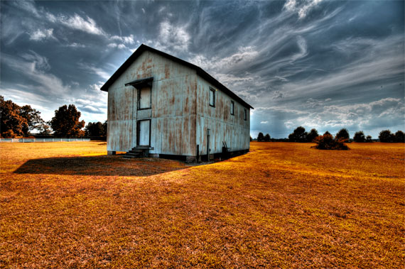
“Bacons Barn” captured by PictureSocial member Joey
Quite an “a-ha” moment.
Like good literature, a choice of subject should be concise, and to the point. Find an “interest point” in what you are seeing in front of you. While writing this article, my eyes see a glass of half-filled water. Is this an interesting subject? Why not? What about just the edges? Or maybe vertically from top, when you can see a circle and a magnified image of what is beneath the glass. Seeing photographically involves having artistic taste. And then comes aesthetic composition.
If you find that “interest point” in the scene, try to keep only ONE central interest point per photo, if you have more, the viewer’s eyes will naturally hover around. The viewer’s brain tries to make a decision of what to look at and concentrate and in this process of searching loses interest because we tend not to think too hard just to figure out what the photo is all about. All this happens very quickly and at a sub-conscious level.
The central point of interest can be a color, an object or shapes. A central theme can be a rhythm, pattern or even chaos. Do not confuse with “one” central point of interest with “one” object in the scene. It can be one object or combination of many objects, the key is to search for pattern or relationships (more to come in the next section)
II. Choose the environment to compliment the subject
You can have multiple or all of the themes (from section I) in a scene. It’s a photographer’s task to identify what needs more attention and what doesn’t. Keep one, eliminate others. The process of elimination can be either completely removing them out of the frame of your photo or optionally making them “out-of-focus” or blurring out the unwanted elements.
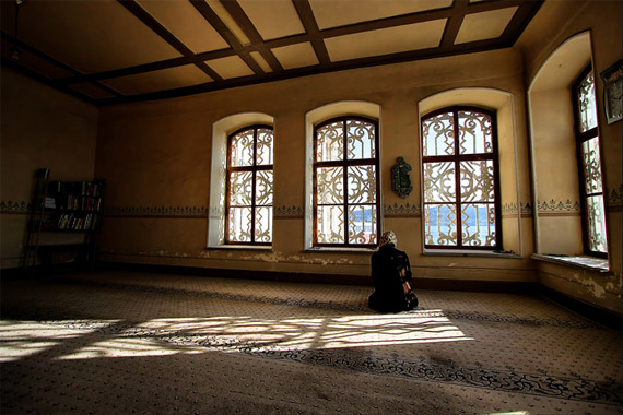
“saving us” captured by PictureSocial member Raluca Mateescu
You can also have a frame to enhance the focus on the subject. A frame can be the outer edges of your viewfinder or anything from the ACTUAL scene, like an arch or tree branches or a window. Find something in the scene itself that can provide a frame to your subject.
Draw attention of the viewers to the detail of the subject. Don’t let distractions dominate the composition. Remember: Less is more.Define your subject so strongly among it’s backgorund that the eyes of the viewers get locked on it. Have (or make) a contrasting background, either Dark on Light or Light on Dark. Also place other objects in the environment keeping in mind the relationship with the main subject.
Remember the concept of a subject does not always apply to conventional “subject” notion that comes to our mind like a person, a structure or a mountain. It can be even be a part of the conventional subject like a dress on a person, eyes of a person, a corner of a structure or a rock on a mountain. Choosing a specific details of a subject generally tells a story and keeps interest among the viewers.
III. Positioning Your Subject
Now that you have selected a subject and complimenting background, let’s get to the “positioning” part. The famous (Thumb-)Rule of the Thirds is so important to follow ( and to break elegantly ) that it is worth mentioning yet one more time here.
Position the subject (chosen in Part 1) in the environment (chosen in Part 2) at 1/3rd distance from the left or right of the viewfinder edge horizontally and 1/3rd distance from top or bottom of the viewfinder edge vertically.
Here’s a diagram that will be useful:
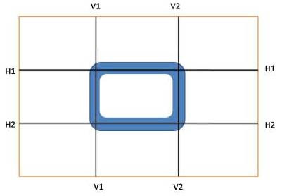
Composition Diagram for Photography
You can see I have divided the viewfinder into 9 blocks. The simple thumb rule says that blue area is the sweet spot for placing the subjects. The intersection is the “sweetest”. Here are few detailed guidelines for different types of subjects –
- Objects (trees, rocks, focused part of any bigger subject) – at V1H2, V2H2, H1V2 and V1H1.
- Portraits (eyes at H1H1)
- Horizons at either H1H1 or H2H2
- Vertical or Horizontal elongated subjects like trees or bridges at V2V2
The negative Rule of Third says dead center is deadly – avoid placing the subject in the centre of the frame and avoid letting the horizon divide the photo into two equal halves (There are exceptions though, which I will cover next in this series).
If you are not able to get the subject into that sweet spots for whatever reason, crop in post-processing to achieve the same effect. But do remember cropping and enlarging might reduce the overall quality of the photo (may not be noticeable when viewed on computer screen or smaller dimension prints).
Hence cropping at source is always recommended. Finally even if you keep the subjects near the intersection of the lines, that will still be better than dead-centering. Next you should align the frame edges with the subject’s orientation. Of course you can always post-process and rotate the photo slightly if required.
You can position the subject such that imaginary lines either converge or diverge from the subject. The line can even be curved or lead towards the centre of interest. This will add a dynamic impact to the photo.
Frame edges can be respectfully avoided for positioning the center of interest, this leads to limiting the eye movements of the viewers only at the edge of the frame.
For action shots, it is advisable to keep a space in front of the moving subject to give a sense of motion, and future position of the subject thus providing anticipation as well.
Try different height, please. Do not shoot at your shoulder height. We are so bored seeing the whole world at our own eye levels, that we need fresh angles to look at objects that normally we don’t try. Try lying down, crouch, get a higher vantage point (hill, table, 10th floor).
Positioning the subject inside a (imaginary) frame serves to isolate your main subject and create an interesting composition. I have covered this part in Part 3 of this series. Also one aspect of positioning is to try to fill the above frame with most of the subject’s area so that you get a closer, tight look of the subject. This specially looks good with nature and wildlife where we have little scope to be actually that close to the subject in our everyday life.
IV: Breaking the Rules
This last element might seem quite counterintuitive, and actually that’s the key to mastering any form of art. Some of the most stunning pictures break the above ‘rules’. And you must be totally familiar with the above rules in order to identify the opportunity where you can break them elegantly. No rules can guarantee a well-designed photograph. If “nice looking” photos do not come to you intuitively, the above “rules” will definitely help you improve the results by increasing the visual appeal of your photos. But we must remember that we must not become a servant and blind follower to the above rules which will lead to “boring” predictability which I had discussed in the Introduction of this series.
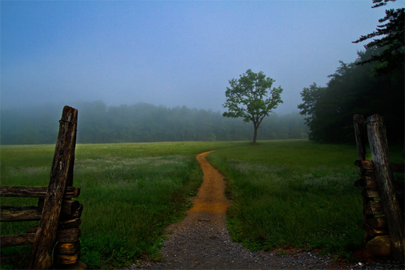
“Morning Walk” captured by PictureSocial member Debra Vanderlaan
There’s one exception to the rule of the third’s though. In case of reflections, do let the horizontal line divide the photo into equal halves to emphasize the quality of reflection by mirroring.
Miscellaneous Tips
Here’s few standalone tips that will help you enhance the scene on your photo.
- When you are shooting something with great height like canyons, valleys or cliffs and you want to emphasize the height, shoot vertically.
- You can repeat visual elements of the subject throughout the photo. Repetition can be in form of color, texture or shapes.
About the Author:
This article was written by Sudipta Shaw.
Go to full article: Composition in Photography
What are your thoughts on this article? Join the discussion on Facebook
Article from: PictureCorrect