You may be wondering – shouldn’t you always place your subject or main point of interest off-center? Isn’t that what the rule of thirds is about? If so, I suggest you refer back to my earlier article about creating strong compositions with a centrally placed subject. It makes the point that it’s perfectly possible to create a well composed image with the subject placed centrally.

Equally, there are times when you should place the main point of interest away from the center of the frame. Not necessarily on a third, but anywhere between the centre of the frame and the edge, centered neither vertically nor horizontally.
I firmly believe that you should never ask yourself whether you should place the main subject or focal point on a third when you take a photo. There are much better questions to ask, such as:
- Is there enough space around the subject to give it room to breathe?
- Are there any highlights near the edge of the frame that take the viewer’s eye out of the photo?
- How does the viewer’s eye move through the photo? This question may be partly answered during post-processing, where you can darken or lighten parts of the image to guide the viewer’s eye.
- How do I make this photo as interesting as possible?
The answers to these questions influence the decisions you make in composition, and help you decide where to place the main point of interest. Let’s look at some examples.
Examples of off-centered compositions
I took the following photo in a historical building in Beijing called Prince Gong’s mansion. There was a courtyard inside, with Tibetan prayer wheels down one side. As people walked into the courtyard, most of them walked down past the prayer wheels, spinning them as they went. This boy decided to join in the fun.
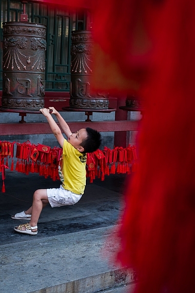
I placed him off-center because was shooting through some red tags (like the ones you see behind the boy) hanging from another structure. I used an aperture of f/5 to make sure the tags were out of focus. They create a frame that adds a sense of depth, and also pushes the eye towards the boy. It helps that his yellow T-shirt contrasts with the surrounding red hues.
The next image was taken in New Zealand. I found these beautiful stones by the sea, and asked my model Ashley to lay down on them.

I liked the way the blue dress contrasted against the more subdued colors of the rocks. I framed the photo so that Ashley’s body formed a diagonal that takes the viewer’s eye from the right side of the photo, to the left. Her face, which is the main focal point of the image, had to be placed off-centre. If it was central there would be lots of empty space on the left-hand side of the image, and it would be unbalanced.
Incidentally, there is an idea that it is better to compose photos to work with the natural tendency to read a page from left to right. As this photo does the opposite and takes the eye from the right of the frame to the left, I flipped it so that you can see the difference.
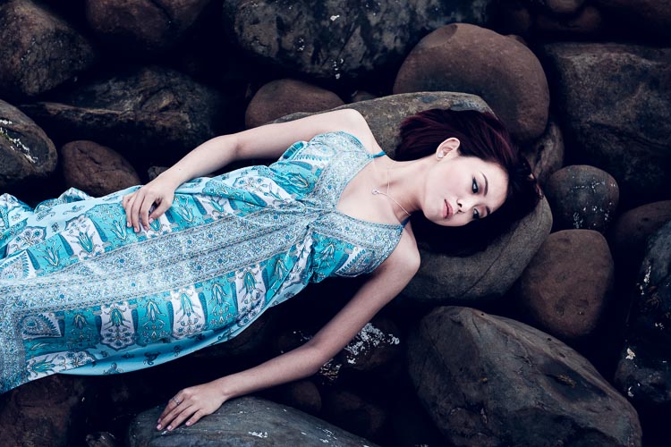
Which version of the photo do you think works best? If you have an opinion please let me know in the comments below. I know which version I think is better, but I’d be interested to hear it from people seeing the photo with fresh eyes.
The next photo was taken in the Great Mosque in Xi’an, China. The boy was trying to catch the cat, and I took a photo as he ran after it.

The boy is the focal point of the image, and because he is moving from left to right in the frame he needs some space to move into – the empty space on the right of the frame provides this. If the boy was centered in the frame there would be too much space on his left.
The next photo, a close-up of a flower, is interesting because it has two focal points.

The main focal point is provided by the open flower on the left. But the closed flower on the right is a second focal point that also pulls the eye. The result is that the viewer’s eye moves back and forth between the two points. When you have two focal points in a photo like this, it makes sense for them to be on opposite sides of the frame, and therefore off-centre, so that they fill the frame adequately.
I took the next photo at a concert in Auckland, New Zealand.
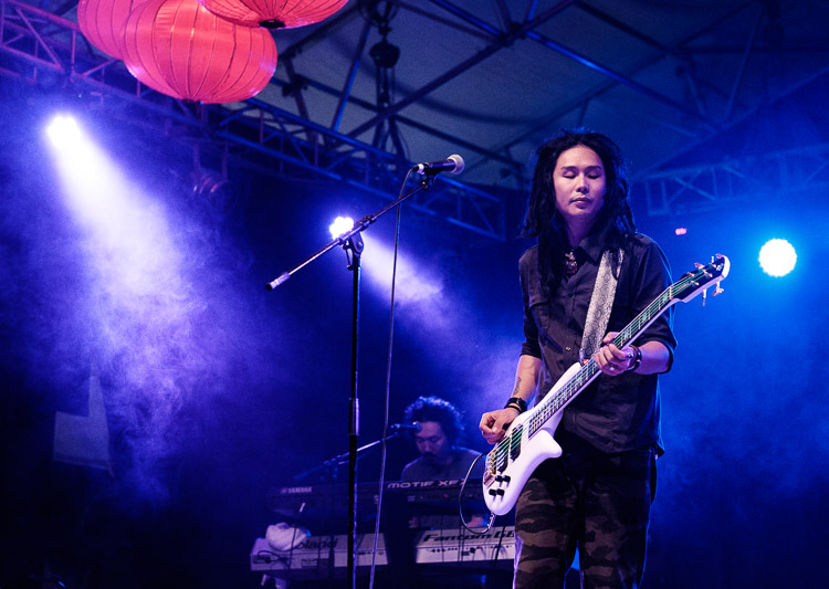
I placed the guitarist off-centre so that I could show him in context. Behind him you have another band member on the keyboard, and three spotlights. You can also see some Chinese lanterns (this photo was taken at the Chinese Lantern Festival in Auckland). The lights also provide leading lines to draw the viewer’s eye to the guitarist.
For the next photo we return to Beijing, this time to the Forbidden City.

I was sitting on a bench resting, when I realized that the doors and pillars you see in the photo lined up nicely when viewed through my 35mm lens. I waited, and took photos as people passed through, hoping to get a good image. Until finally the little boy you see in this image walked through the doorway and hid. A few seconds later he jumped out to surprise someone – as a man, presumably his father, walked through the doorway.
The boy is so small in the frame that you may not have noticed him right away. It is good for photos to contain surprises like this, as a kind of reward for the viewer when they finally spot it.
The colors in this photo also harmonize well. The yellow of the boys’ shorts echoes the yellow around the door frame, and the yellow tiles on the pillars. This is purely luck, but it’s the kind of luck that presents itself when you are present with your camera.
What do you think? What factors do you consider when deciding where to place the main focal points? Let me know in the comments.
Mastering Composition
If you’d like to learn more about composition then please check out my ebook Mastering Composition: A Photographer’s Guide to Seeing.
The post How to Improve Composition by Placing your Subject Off-Center by Andrew S. Gibson appeared first on Digital Photography School.