This is the second part of a series that will explore a studio setup aimed at product photography. You can see the first here: Equipment Tips for Quick and Efficient Studio Product Photography.
Although this is built primarily for product photography you can use it for a few other genres. In this second part I will be going hands on with an actual shoot. I will show you how to set up a shoot based on the equipment from part one and go over some tips that I have gathered over the years of using it. If you haven’t read part one yet, head over there and give it a quick look so that you are up to speed with how we are about to implement that system.
Getting set up
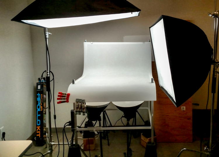
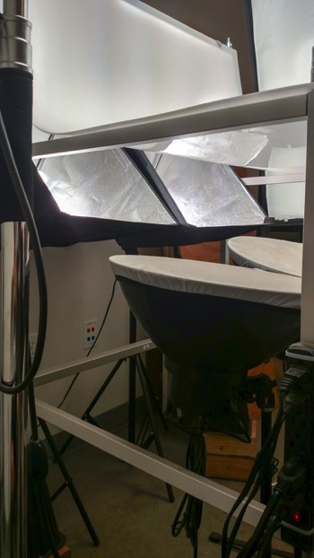
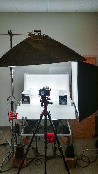
Now that you are caught up let’s dive in. For almost every shoot I start by turning on my table lights. Those include the lights behind and beneath my table to allow the surface to glow from within (see photo above).
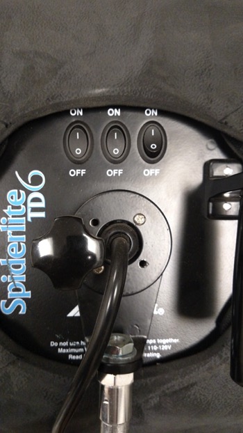
I have one of my Spiderlite TD6 heads above the table aimed straight down. This really helps fill in the top of the product and knock down the shadows caused by the table that underlights the product. My second TD6 light is the one that moves around my set. This is my main light as it is set brighter than the others and it is responsible for the main direction of light.
Settings for my lights will differ slightly from what you will need but this is a good starting point. The overhead TD6 is set for 30% power. The two Flashpoint lights under the table are set to 50% power. I have two small fluorescent softboxes behind the table at full power. My main TD6 is usually at 66% power (two switches turned on).
 |
 |
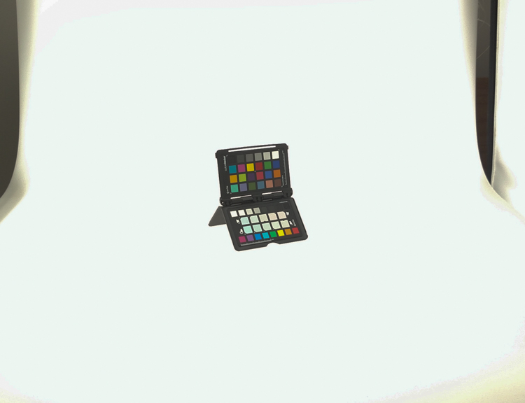
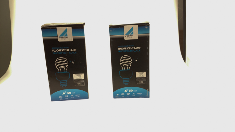
These are the settings I run on my lights, and they work for almost all of my clients that need photos shot for their Amazon, Ebay, Etsy stores or their online company catalog. You need to realize that all bulbs are not created equal and that if you are mixing different daylight balanced fluorescents that colors can come out altered in your shots.
Set the color balance
To counter this problem, invest in the Xrite color checker. Make a custom profile for your camera using your lights and this will ensure that colors are accurate. To find more information on incorporating the Xrite into your workflow check out this article by Andrew Gibson: How to Use the X-Rite ColorChecker Passport to Obtain Perfect Color.
Set the exposure
As for my camera, I have one of my custom buttons pre-programmed and ready to go, I simply switch to C2 and I am shooting in seconds. My C2 settings are fixed for Manual Mode at f/16 and 1/6th of a second, highlight detection on, and a square crop. This will get me very close with my studio setup. If I need a little more blowout on my white table I slow my shutter speed, or alternatively if any clipped whites creep into my product I can increase the shutter speed.
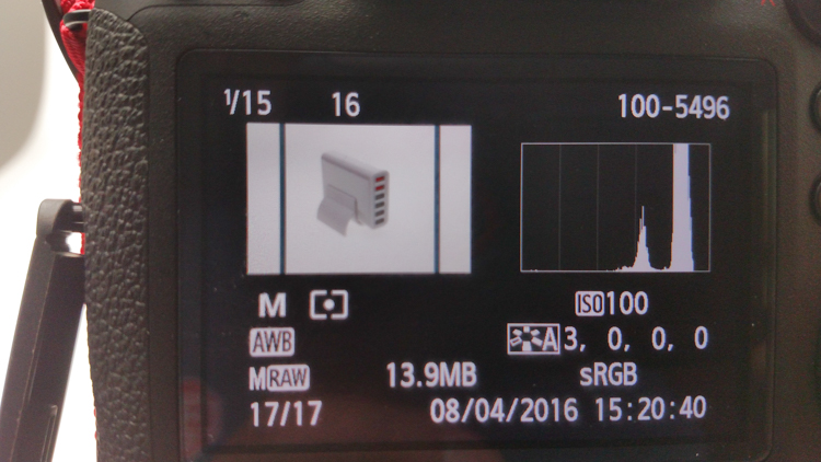
I also find that manual focus is much faster in this situation. Focus hunt happens a lot during shoots and it eats time quickly when you are shooting 20+ products with 4+ angles per part. With a quick flick of a button on the back of my camera, I can enter Live View mode, zoom in, and get the exact focus that I would like. I shoot with highlight detection on so that when the image comes up for review anything that is clipped will flash black.
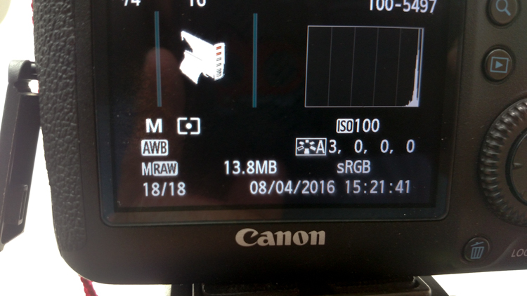
From there I am able to determine if I obtained a proper exposure. The histogram doesn’t help very much here as it is always going to be spiked to the right because I am purposely blowing out the background. I have also set my camera to crop the image to a square as this tends to be the only format my customers want for this style of photography.
Make a raised platform
A big tip that I can share with you is to use a raised platform. The reason you need a raised platform is because when an object gets placed directly on the table surface it tends to add a glaring highlight to the bottom of the product. The tabletop and the highlight are so close in terms of power it becomes difficult to blow out your table and keep the highlight on the bottom of your product from clipping. I have a super easy solution to get around this dilemma. What I did was take two boxes, stack them on top of each other, and then wrapped both in regular old white printer paper.
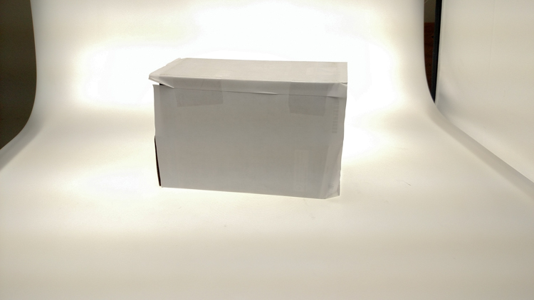
If you leave them unwrapped then you will have black strips reflecting in your product. The next thing I did was get a sheet of clear acrylic from Lowes. It is a quarter inch thick, and is 18×24″. It cost me around $ 20. I place this acrylic on top of the wrapped boxes which raises the shooting surface by seven inches.
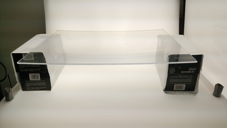
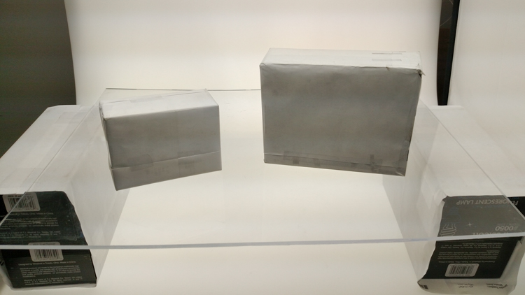
What this does is allow the table to blow out, but because of light falloff it prohibits the product from being overly lit on the bottom and clipping the highlight. While I was at it I wrapped two smaller boxes of different sizes in white paper as well. I use these quite often to bounce light back into the shadows.
Ready to place the subject
Now that we have gone over power settings for the lights, the configuration of my camera, and some tips on knocking down blown highlights by raising the surface, let’s set up an actual shoot. We will ease into it and start with something that doesn’t give you a whole lot to think about. Let’s do a regular coffee mug.
I placed the mug directly in the middle of the acrylic. The overhead light is directly over the mug aimed down. The other TD6 is at 90 degrees, hitting the mug from camera right.
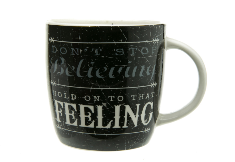
The resulting image is 95% ready to go online almost straight out of the camera. There are a few things you might want to obsess over, like adding more white reflection and narrowing the dark gap. But honestly, it’s ready to go as is. I did say this was an easy subject so let’s move onto something a bit harder, shall we?
Let’s try a harder subject
The next thing we will attempt is something that gives plenty of photographers fits; a white subject on a white background. Well, because we have a blown out table top and we are controlling the amount of light that the tabletop is introducing to our subject, it actually isn’t difficult to get great results.
Let’s start with the same lighting. Light from directly above, and one more light at 90 degrees to camera right. Straight out of camera we can see we did a pretty good job.
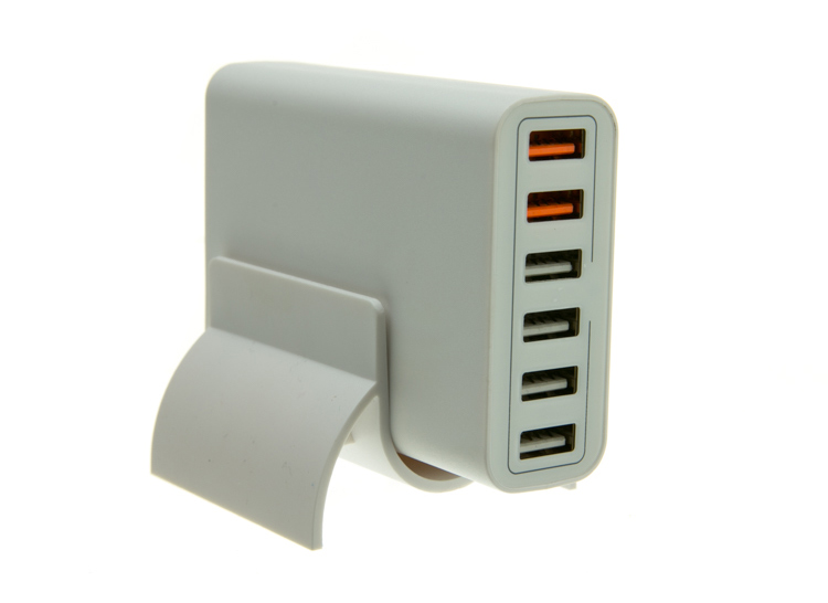
There is no major clipping going on the subject yet the background is completely white. There is not a lot of shape and dimension to the item, however. So let’s move the right light so that instead of 90 degrees it is 45 degrees. Now the light will hit the product on the front of this USB hub. Bingo.
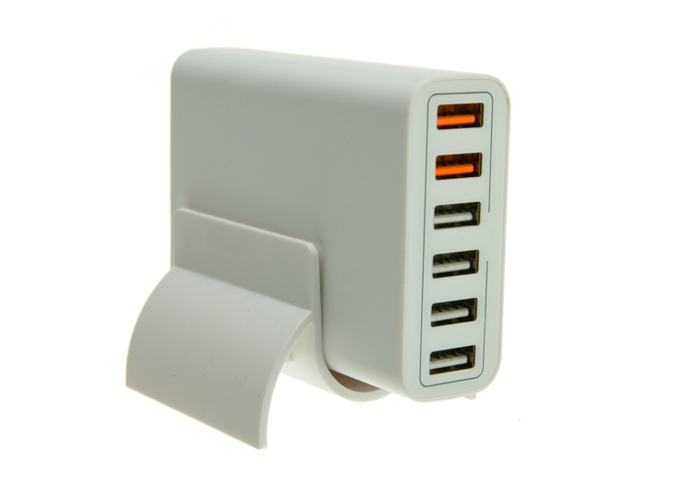
We now have highlights on the leading edges which helps give it shape and dimension. It’s very close, but we can still do a little better. Let’s add one of those white wrapped boxes we made earlier to the shadow side and bounce some of our key light back into the product.
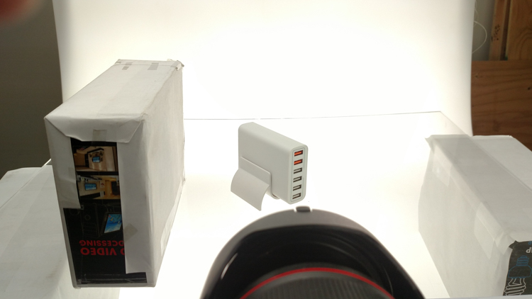
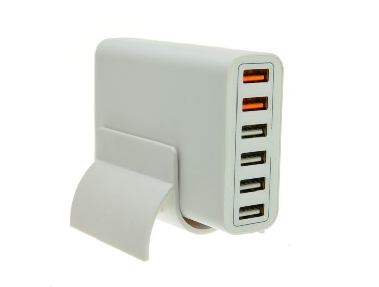
Now what we get is just a subtle fill in the shadow and that just about does it for this product. Yes, we could obsess further over some other details and finesse it some more, but remember this is a speed table. We are trying to get products on and off the table quickly. This image would pass for all of my clients.
Shooting reflective surfaces
For our final demonstration let’s do a reflective surface. Leaving the lights exactly the same as the previous shot (again because this is about speed) I will remove the white box that is acting as a fill and shoot this RCA adapter.
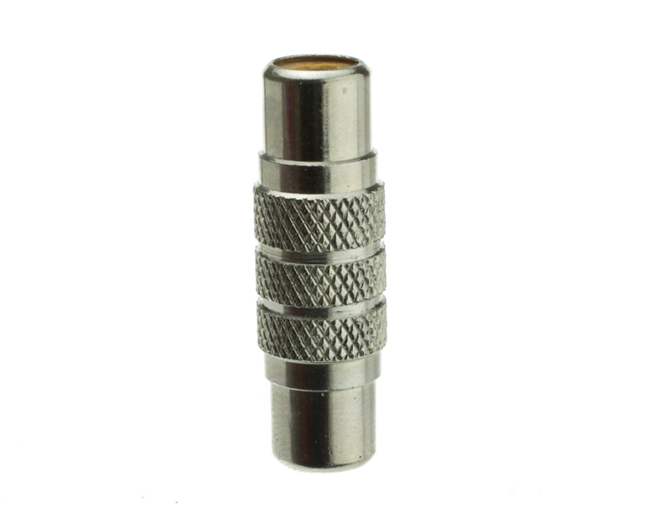
Again right out of camera it is pretty good. You can see some red reflecting on the shadow side in the lower left which is coming from a red bag out of frame, and there is a really dark strip running down the left/center side. Let’s clean those two things up and try again. I will remove the red bag from out of the frame and put the smaller white box fairly close to the adapter.
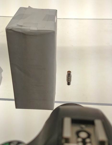
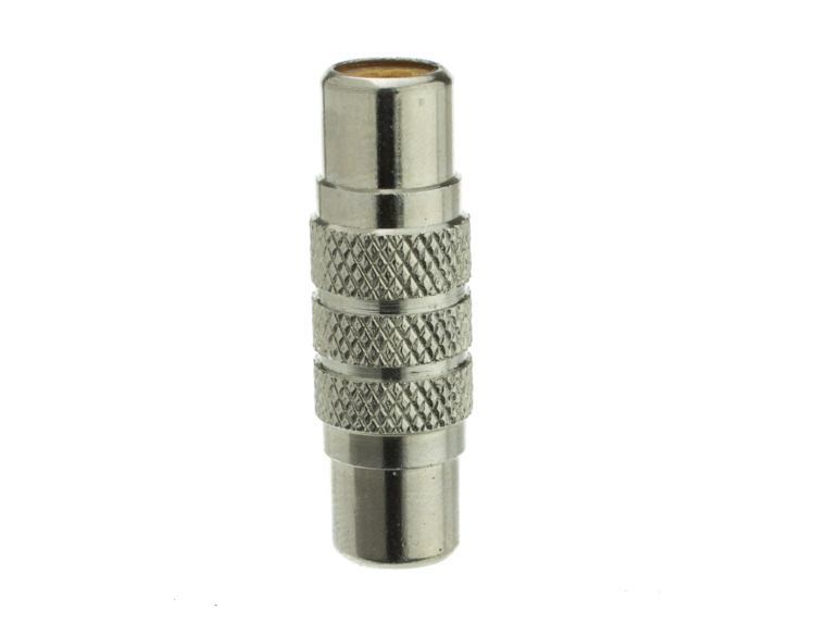
With just those two changes it has made a large difference in the shot. Let’s try and clean this up a tad more. The reason there is a black line is because it is reflecting the much darker room behind the camera. Using the angle of incidence I will use my large white box just below my lens and throw light back into the subject.
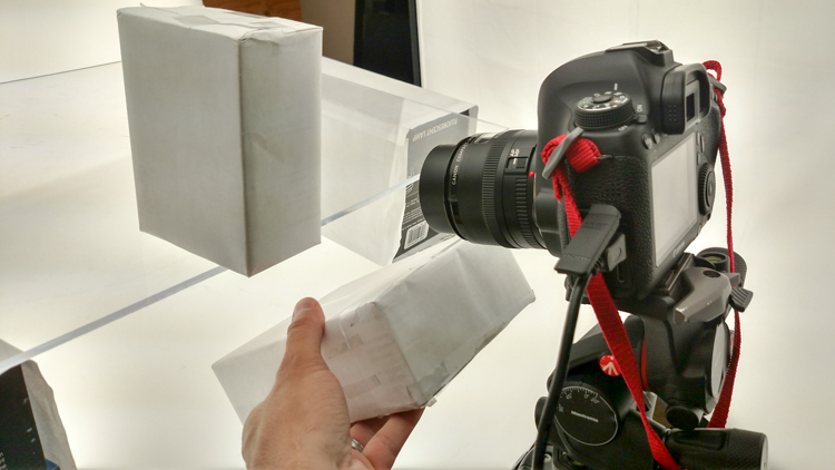
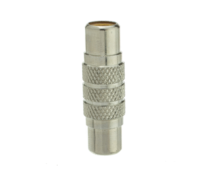
There we go! A perfectly acceptable image for an online catalog. The RCA adapter is cleanly lit, no harsh black lines, a fully white background and it is already squared because of our camera settings. This image is ready to go.
Read more info about shooting reflective surfaces here.
Summary
The reason I built this system is for speed. If you are trying to knock out 100 products a day, with this system you could absolutely do it. I know because I have done it.
Of course, there is the third and final part of the process and that is editing using your favorite software.
I use Lightroom, and it will really going up your product photography game. You need it to catalog all of your client’s images, keep track of the part numbers, export to their specification and clean up shoot errors using very little time.
Please share your questions and comments in the space below.
The post Tips for Fast and Effective Studio Product Photography by Jacob Macias appeared first on Digital Photography School.