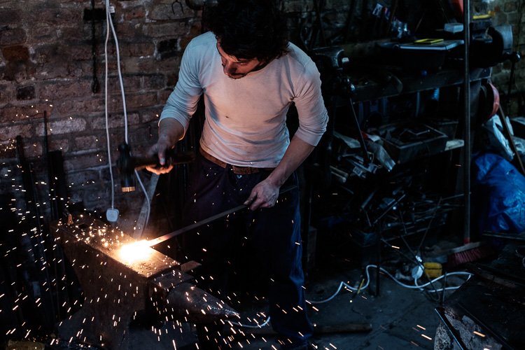
An advantage of using the Raw format is that it gives you a tremendous amount of freedom when it comes to processing. This, combined with Lightroom’s powerful processing engine, opens up lots of possibilities for the creative photographer. I’d like to show you how I processed a Raw file using only Lightroom.
Photoshop users will also be able to follow along with most of it, as Adobe Camera Raw shares many of Lightroom’s sliders and functions. This is the original Raw file, as it came out of the camera.
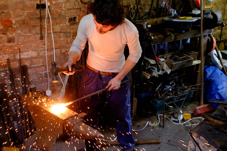
And here’s the finished result after post-processing.

The story behind the image
As you can see there’s quite a difference between the before and after images. But before we look at how I achieved this in Lightroom I’d like to share the back story of the photo. This is important because it guided the way that I decided to process it.
I took the photo in a blacksmith’s forge in the English town of Spalding earlier this year. The forge is remarkable because they use working practices that date back over a hundred years. It’s open to the public and they have demonstrations where you can take photos. The forge is small and you can get quite close to the blacksmith, which allows you to take intimate portraits like this one.
The light was coming from windows in front of the blacksmith and behind him, as well as from the hot piece of metal he is hammering. There was also overhead fluorescent lighting. The end result is that the light is fairly flat and boring, which is something I wanted to change in Lightroom.
A blacksmith’s forge should be lit by a combination of cool natural light and the fiery orange glow from the fires, not fluorescent light. I wanted mysterious shadows in the photo, not every detail visible. Points like these are important because they help you work with a destination in mind, rather than aimlessly pushing sliders around to see what happens.
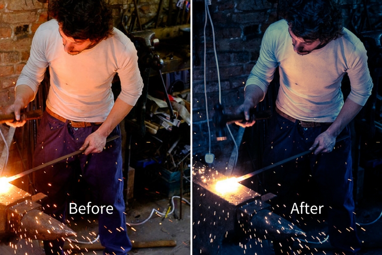
First steps – color corrections
The first steps involve getting the colors right, as this affects the look of the photo and everything you do from this point forward. The most important setting is in the Camera Calibration panel. A lot of people gloss over this panel as if it’s not so important. This isn’t helped by its placement at the bottom of the right-hand side in Lightroom’s Develop module.
When I took the photo I had the color profile set to Velvia, which gives high contrast and strong, saturated colors on my Fujifilm X-T1. It doesn’t matter what your color profile settings are on your camera if you’re shooting Raw as you can change them in Lightroom. I wanted softer, more subtle colors, so I changed the setting to Classic Chrome.
Note: This setting is only available on some Fujifilm cameras. The settings you see in the Camera Calibration panel depend on your camera model.
Next, I went to the Basic panel and set the White Balance to Auto. This tells Lightroom to decide how to set the color temperature to give the image neutral colors. How successful Lightroom is at this depends on the content of your photo. If you have mixed lighting sources, as this photo does, even Lightroom’s powerful algorithms aren’t going to give you anything other than an educated guess. It’s not possible to get rid of all color casts with mixed lighting.
Regardless, Auto White Balance gave me a good starting point. This is what the photo looks like so far. You can see it’s already quite different from the starting image which was quite orange.
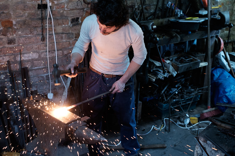
Auto White Balance applied.
Tonal adjustments
The next step was to start making the transition from an image that is too bright to one that is dark and moody.
I did this by setting the Exposure slider to -1.0. This made the shadows too dark, so I brightened them by setting the Shadows slider to +25. I also set Clarity to +31 to bring out the gritty textures in the scene. See my settings below:
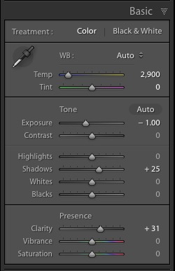
As you can see now that the image is darker the blacksmith’s face is lit by the glow from the hot metal he is working with. This was lost in the original.
Tonal adjustments and Clarity applied.
Cropping to remove distractions
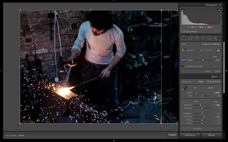
Now I can see that the photo has a major problem. There is too much empty space on the right-hand side, and the blue plastic is a major distraction. In hindsight, the composition would have been better if I had placed the blacksmith in the center of the frame. However, we can compensate for that by cropping the image.
I activated the Crop Overlay (keyboard shortcut R), set the Aspect to 4×5 / 8×10, and cropped the image. This cuts out the distractions on the right-hand side and brings the attention back to the blacksmith.
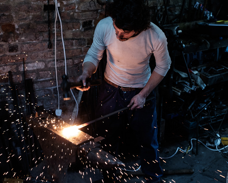
This is the result after the image has been cropped.
Refining the image with local adjustments
So far the adjustments made have all been global. That is that Lightroom applies them equally to the entire image. Now it’s time to refine the tonal values with some local adjustments.
I started by adding a slight vignette using the Post-Crop Vignetting tool in the Effects panel. This darkened the corners slightly.
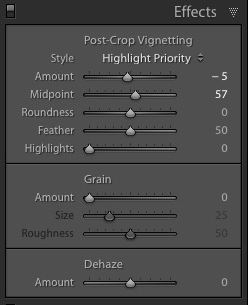
Next, I decided that I wanted to make the background even darker. This is going back to the earlier decision to make the image dark and moody as if the blacksmith is working in a much darker environment.
I added three Graduated filters to darken the edges. The screenshots below show the placement of the filters and the settings used.
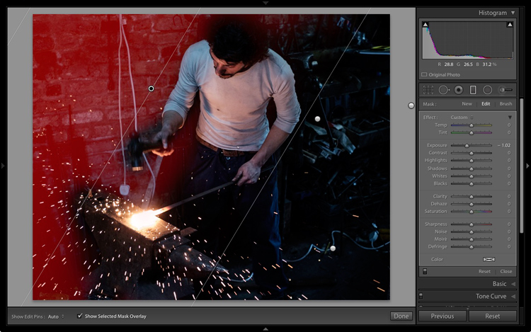
Graduated Filter #1 applied on the upper left of the image.
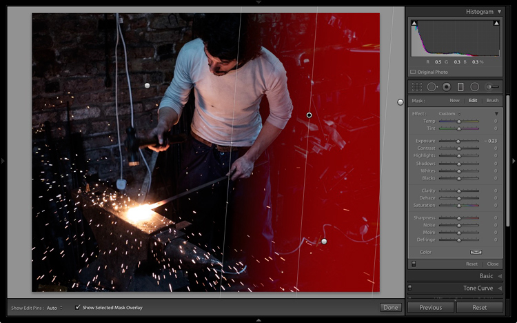
Graduated Filter #2 applied on the right side of the image.
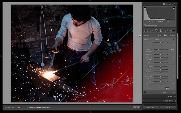
Graduated Filter #3 applied on the lower right corner of the image.
Then I used an Adjustment Brush and moved the Shadows slider right to make the blacksmith’s hair lighter and bring out the detail.
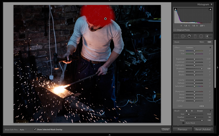
Adjustment Brush applied to his hair to bring out detail.
This is what the image looks like now with these adjustments.
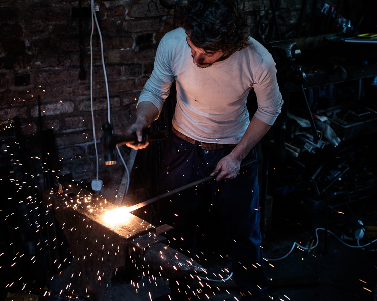
After local adjustments have been applied.
Split toning for color grading
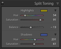 Finally, I decided that the mood could be further enhanced with a split tone applied: blue to the shadows and an orange tone in the highlights.
The idea was to emphasize the difference in color temperature between the orange light from the hot metal and sparks, and the background, which in my imagination is lit by daylight (but in reality was also lit by fluorescent light). I did that in the Split Toning panel with these settings.
Here is the final result.

Final image after split toning applied.
Final thoughts
As you can see, even though the final image looks remarkably different from the starting Raw file, the steps involved in the processing were quite simple. It didn’t take long to get from the starting point to the end photo. This is mostly because I had a firm idea of what I wanted as the end result before I started processing the file.
If you have any questions or thoughts to share about the processing I did on this image then please let me know in the comments.
If you’d like to learn more about processing your photos in Lightroom then please check out my ebook Mastering Lightroom: Book Two – The Develop Module.
The post How I Processed This Photo Using Only Lightroom by Andrew S. Gibson appeared first on Digital Photography School.