With the advent of the mobile phone and tablet, everyone seems to be taking photographs. And all many people want is a record of a holiday or family event or a special moment in their lives to share with their friends and perhaps to look at some years later when it will bring back a fond memory of times past.
Some of us, however, want to take our photography one step further and turn it into a hobby which we can develop and improve. So we dispense with our point and shoot cameras and stop using our phones and invest in reasonably decent cameras. Personally, although I had been taking pictures for almost 50 years, I only took it up as a serious hobby in 2010 when I purchased a Panasonic DMC-FZ38 prior to visiting Kenya on my first safari.
To begin with, I looked at the 128 page manual and hardly understood a word. So I set the camera to auto and went off on safari. I took some great photos, but it was only after I joined a local camera club and started to learn about the art of composition that I began to actually look through the lens and think about what I was doing, instead of simply pointing the camera at an object and pressing the shutter.
Like me, I suspect that many new photographers get confused, or even totally put off, by such things as focal length, ISO, aperture, shutter speed, focusing, exposure, etc. And while I believe that it is very useful to understand the more technical elements—and I shall be covering some of those in later articles—I do believe that the most important element for a new photographer to get to grips with is composition.
All digital camera manufacturers spend a large amount of time and money on software to help the user get the correct camera settings to capture that shot and, as I did initially, if you set your camera on auto, the vast majority of time you will get technically good results. However the one thing that no camera is able to do, no matter how much money you have spent buying it, is compose a photo that is attractive to the eye.
So what do I mean by composition? Putting it into its very basic form, composition can be said to be the way to create a photo that is aesthetically pleasing to the viewer. Sounds simple, doesn’t it? Google “composition in photography” and you come up with such results as “20 Composition Techniques That Will Improve Your Photos,” “10 Top Photography Composition Rules,” “9 Top Photography Composition Rules You Need To Know,” “18 Composition Rules For Photos That Shine,” “5 Elements of Composition in Photography,” “5 Easy Composition Guidelines,” “The 10 Rules of Photo Composition,” “12 Rules for Effective Composition in Photography,” etc.!
While you will undoubtedly learn by reading all of those articles, I will concentrate on a few simple rules that I follow. Before I go further, while some of these are called rules, remember rules are there to be broken. What I am trying to do is to encourage you to think about what you are trying to achieve when looking through the viewfinder. I will start with something that you have probably already come across—the rule of thirds.
The Rule of Thirds
Basically, if you imagine a photo divided into thirds, both horizontally and vertically, the main subject of the image should be where a vertical line crosses a horizontal one, as in this photo of a leopard in the Serengetti. Also the branch runs along the bottom third of the frame. This is much more pleasing than if the leopard was bang in the center of the image.

Many modern cameras allow you to place a grid in the viewfinder, which can be used to place the object where two lines intersect.
While we are talking about the rule of thirds, it is generally best to place the horizon on one of the thirds, rather than in the center of the frame, depending on whether the main points of interest are in the sky or on the ground.
Leading Lines
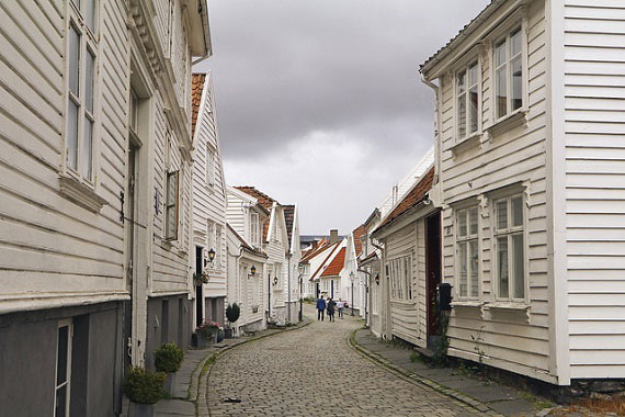
These lead the viewers eyes into the picture either to the main subject or on a journey through the whole of the picture. In the image below of the Old Town in Stavanger, the viewer is taken into the picture by the lines of the timber boards of the building toward the center, while the curves of the pavement and road, coupled with the pedestrians walking down the road, help the viewer complete their journey.

Symmetry
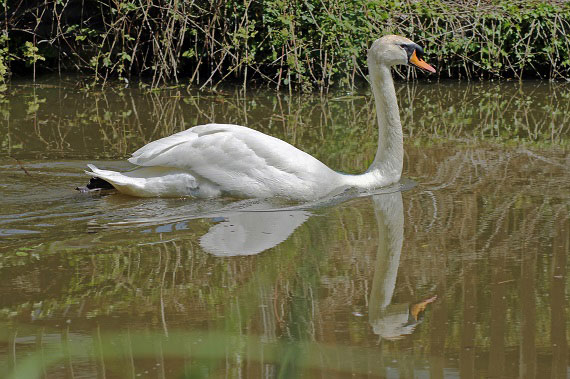
To demonstrate that the rules are no more than guidelines, the next point contradicts the rule of thirds. If your image is symmetrical, then it could benefit from being centered either on the horizontal or vertical center line. This works particularly well for reflections, as is the case below, where the mute swan and its reflection are centered along the horizontal center line.

Or for architecture, where in the shot from the Dome of St Peter’s, the image is centered on the vertical line.

Rule of Space
This rule is talking about giving the subject in the photo space to move into the frame. This particularly applies to animals and vehicles. The first photo below, of a Secretary Bird, was taken on my first safari before I had learned anything about photography, and as you can see, it looks a little odd with the bird looking out of the frame and all the space behind it.

The second image was taken three years later when I was aware of the need to give the subject some space to move into.

I hope you will agree that the second one looks more natural and is better on the eye.
Rule of Odds
Generally speaking, it is thought that photos with an odd number of subjects is more visually appealing and natural looking than those with an even number, where the viewer’s eyes may flick around the image, unsure of where to settle. The main reason that I have included this is that it gives me an excuse to include my award winning image of a three-headed giraffe. Other than this, which was a purely lucky shot, I do tend to use the rule of odds if taking a close-up of flowers or the like.

Patterns
I will close on patterns, which can be found everywhere, both in nature and architecture and the image below, which shows reflections in the Birmingham Symphony Hall, combines patterns with one of my personal favorite composition techniques, the use of reflections.

I hope that I have given you a brief insight into composition and that when you next look through your viewfinder you will at least stop and think for a few seconds at what you are looking at and how the shot may be improved. But just remember, these rules, and all the others you will come across, are simply guide lines to help you go in the right direction; they are not railway tracks that you have to stick to rigidly.
Finally, I will end with the words of Pablo Picasso: “Learn the rules like a pro, so you can break them like an artist.”
About the Author
Tony Murtagh lives in Birmingham, England and enjoys photographing landscapes, cityscapes, wildlife, plants, and flowers, both locally and in Europe and Africa.
Go to full article: Rules of Composition
What are your thoughts on this article? Join the discussion on Facebook
PictureCorrect subscribers can also learn more today with our #1 bestseller: The Photography Tutorial eBook
The post Rules of Composition appeared first on PictureCorrect.