BlackRapid Sport Breathe Camera Strap – $62.86 Shipped (Reg. $73.95)

Use coupon code PPEBH19 at B&H to get the BlackRapid Sport Breathe Camera Strap for $ 62.86 with free shipping. Regularly $ 73.95.
 
This is by far my favorite type of strap (I still use the older non-Breathe Sport-RS version) and I highly recommend trying it out. Don’t forget, you can convert this strap for Arca-type plate compatability very easily. [Sean]
 
Product Highlights
 

  • Cross-Body Strap for Right-Handed Users
  • Places Camera Upside-Down Against Waist
  • Allows Easy and Fast Access to Camera
  • Nylon Webbing, 65.7″ Adjustable Length
  • Moisture-Wicking, 4.0″-Wide Shoulder Pad
  • Spring-Loaded Bumper Locks for Camera
  • Durable, CR-3 ConnectR Locking Carabiner
  • Brad Breathe Stabilizing Strap
  • Dual Harness with Second Strap, CoupleR
  • FR-5 FastenR Breathe, Soft Pouch

Canon, Nikon, and Sony News, Deals and What’s New at The-Digital-Picture.com

Posted in Photo Equipment | Tagged , , , , , , , , | Leave a comment

Opinion: Android’s customizations could lead to its downfall

The discussion around choosing a mobile operating system has gotten a bit stale lately- you either get an iPhone or one of the many Android based phones. But that wasn’t the case a few years back when you a lot more choice with operating systems on a phone such as Symbian, BlackBerryOS, WebOS and Windows Mobile, all competing against each other. In fact, a lot of what we find on Android or iOS today took its roots from the golden days of mobile operating system wars. 

Though Apple and Google continue to refine their respective OSes, we don’t see many giant leaps- possibly due to the nature of how duopolies work. But I can see a scenario playing out where consumers have at least two more options available to them other than iOS and Android.

The first contender is Huawei with its open-source HarmonyOS which is being forced into development due to the trade wars between the US and China. Not being able to offer Google services is an existential threat to Huawei’s mobile phone business outside China and the company has realized that it needs to own as much of its stack as it can. But what can make Huawei succeed where others such as Firefox, Samsung and Ubuntu have failed?

harmonyos

It’s mainly a number game. According to IDC’s 2019 first quarter report, Huawei shipped over 59 million units globally which gives it an impressive 18.9% market share of the smartphone market. Now imagine if the Chinese Government steps in and “asks” other Chinese phone manufacturers such as Oppo, Vivo and Xiaomi to adopt the open-source HarmonyOS? Between these companies, IDC estimates a market share of over 42% and that could lead to a devastating blow for Google and the Android ecosystem as we know it.

Huawei as well as Xiaomi and Oppo already have their custom UIs developed on top of Android. It's the layer their consumers see and recognize a phone by and with a little work, each of these companies can port their user-interface to HarmonyOS. Their consumers will continue to see a UI that is familiar to them and as long as the apps that matter to them exist on HarmonyOS, they’re unlikely to care about the underlying operating system. In many ways, this is the reason why people chose a “Samsung” or “Huawei” phone and not necessarily an “Android” phone.

What’s left is convincing developers to create apps for this new platform, but with a 42% global market share (assuming Vivo, Xiaomi, Oppo and co. agree to using Harmony OS) and a few billion dollars in funding it should make things easier for Huawei. Sure, it is an area where giants like Microsoft or BlackBerry failed but their market share of targeted phones never touched double-digits.

The second player that could also chip away Android’s market share is Microsoft. Yes, Microsoft has already failed twice with mobile operating systems, but with the introduction of its new dual screen devices- the Surface Neo and Surface Duo, there’s a plan for Microsoft to make a come back.

Let’s start with Surface Neo and Windows 10X. From a hardware perspective, there are components currently available that are fast enough to easily run the full version of Windows 10 on Surface Neo so why does Microsoft feel the need to release yet another version of Windows 10? Remember Windows 10 S that was released just a couple of year back?

It's because Microsoft wants to start over by eliminating all the bloat that legacy Windows carries with itself but at the same time retain the ability to run modern apps. Windows 10X will do just that and is expected to only come as bundled on devices. You won’t be able to download and instal it as you do with the regular Windows 10. That’s how mobile operating systems are currently distributed and thus, Windows 10X also seems like a very good fit for a phone form factor such as Surface Duo.

But Microsoft chose to release the phone-sized Surface Duo with Android. And the very valid reason Panos Panay, chief product officer at Microsoft gave for that was that apps exist on Android. Microsoft has already failed twice as a mobile OS platform and it probably doesn’t want to directly enter this space. 

And that’s smart which is why Neo exists. If Microsoft can establish a good eco-system on the more “laptop-like” Surface Neo then it will create a future version of Surface Duo pre-installed with Windows 10X. Microsoft has tried this with metro apps and limited success but the proposition this time is the sexy new form factor with dual screens. 

What’s really smart about Microsoft’s approach is to keep the UI consistent across both the Windows 10X based Surface Neo and the Android based Surface Duo. This will make “upgrading” users from Android to Windows 10X on the Surface Duo a much easier transition- much like what Huawei could do with HarmonyOS. And in case Microsoft fails to make a dent with Windows 10X, it could potentially switch a future version of Surface Neo to Android.

It’s interesting how both Huawei and Microsoft could leverage the customization of Android to their advantages- and possibly as stepping stones to lure customers into their own platforms. What is considered as one of Android’s greatest strength could very well be the reason for its downfall.


TechRadar: Photography & video capture news

Posted in Photography | Tagged , , , , , | Leave a comment

What You Need to Know to do Successful Restaurant Photography

The post What You Need to Know to do Successful Restaurant Photography appeared first on Digital Photography School. It was authored by Darina Kopcok.

successful-restaurant-photography

If you want to be a food photographer, you’ll likely start your career shooting restaurant photography. This is how most food photographers get their start. Restaurants have smaller budgets, so they’re open to working with new photographers.

However, photographing for restaurants isn’t that easy. Not only do you have to be skilled at shooting food, but you also need to be able to shoot interiors and portraits of the chef and other staff.

Restaurant photography can be a lot of work, and there are a lot of ins-and-outs you should know to make sure you don’t end up getting burned by this very specific type of shoot.

What You Need to Know to do Successful Restaurant Photography

Ask for a shot list

Before you can give a potential client an estimate, you need to know what you’ll be photographing in order to estimate how long the shoot will take you. For example, beverages can take longer to photograph than a plate of food, as managing reflections in glass can take time and be challenging.

You should base your estimates on the project scope. If you can’t estimate how long the shoot will take you, you can’t price your services accordingly. Get a breakdown of how many food images will be required, how many drinks etc.

Some restaurants want you to bring in your own surfaces, dishes, linens etc. for a more magazine editorial feel. In this case, note that it will take longer to shoot this type of scene than it will shooting their own dishes on the restaurant tables.

Scout for the location and light

Check out the location beforehand so you know what you’ll be up against in terms of lighting. You’ll also need to figure out where to set up your equipment and workspace. This should be done with agreement from the manager or proprietor.

It’s important that if the restaurant is open when you shoot, that you’re as unobtrusive to the patrons as possible. See if the client can close off a section of the restaurant where you can work without bothering anyone, and vice versa. 

successful-restaurant-photography

Discuss styling the food

When shooting for restaurants, you should make clear on the outset that you’re not a food stylist and therefore are not responsible for how the food looks.

Food styling is a different occupation. It requires a separate skill set from photography. Your job is the lighting and image capture, not the plating of the food.

Of course, you should always be aware of garnishes and stray crumbs, and generally, make sure the food looks its best for the camera. I’ve been known to send back a sloppy looking burger or two.

The point is that clients need to make sure their chef is up to the task. Otherwise, they should hire a food stylist to guide them. A food stylist can be pricey and not feasible for an already tight budget. In the case that a client refuses to hire one, they should know that the look of the food on the plate ultimately falls on them.

Make sure you state this in your contract. You have a contract, right?

What You Need to Know to do Successful Restaurant Photography

Bring a food styling kit and some basic props

While you won’t be plating and styling the food, you should still bring along a basic food styling kit that includes items such as tweezers, cotton swabs, and small brushes to tame errant garnishes or clean unwanted crumbs and drips from the plate. You want to do the best job you can with what you’re given.

It’s a good idea to come prepared with some props as back up. Bring a stack of linens in various shapes, sizes, and colors, and maybe some cutlery. Sometimes clients want their own tables, flatware, and dishes shot as they are experienced by the patrons, but many have a branding direction in mind that requires a specific look or ambiance. 

For example, when clients wanted me to create dark and moody images for them, I bring in small, dark dishes and vintage cutlery – the opposite of the large, white dishes you see in most restaurants. 

successful-restaurant-photography

Use a tripod

If you shoot only in natural light, be aware that most restaurants are too dark for food photography.

You’ll need to shoot by a window and use a tripod so you can decrease your shutter speed and make a longer exposure. This won’t work for photographing people, however, as they will be blurry with a slow shutter speed.

If the images will only appear on the web or in social media, you can crank up the ISO and fix the noise in your images later in post-production.

When I scout the location, I try to take a few test shots and see how they look in Lightroom before making my lighting decisions.

successful-restaurant-photography

Shoot horizontally

Have a conversation with the client about how they would like the images shot. Most restaurants only need images for their website. Interactive web design often requires that images be shot in landscape orientation.

If the client will be printing some of the images on a menu, this may require a vertical format (and a higher resolution). Make sure to discuss the best picture orientation with the client. Make note that if they want both, it can take you up to twice as long to shoot the images, as not only will you have to adjust the camera, but you’ll have to recompose each image.

Shoot tethered 

I always hook up my camera to a laptop so the client can view the images captured by my camera. Shooting tethered allows you to see a larger, more accurate rendition of your shot than you can get from the screen on the back of your camera. You can use Lightroom or Capture One Pro for tethering. Make sure you have a high-quality tethering cord. 

What You Need to Know to do Successful Restaurant Photography

Work with the client

Ultimately, you want to produce good work that makes the client happy. For this, the client needs to be involved in the process. They must be present at the shoot to provide creative direction and approve the images that are captured. That way, they can’t come back and tell you they don’t like them, or that they don’t align with the branding or aesthetic they had in mind.

I have a clause in my contract stating that I will not begin a shoot without someone representing the restaurant present. Also that the client will forfeit the deposit if I need to pack up my things and leave. Believe me, you don’t want to get into this situation. 

Collaborate with the chef

Involve the chef in the process as much as possible. When you make an appointment to scout the location, ask if you could meet the chef.

Making the chef feel like an important part of the process can make a big difference in the outcome of your shoot. The shoots that end up being the most easy and fun are the ones where the chef is enthusiastic about working with you and making the food look its best for its moment in the spotlight.

What You Need to Know to do Successful Restaurant Photography

In conclusion

One more thing. Before you set foot in the restaurant with your camera, make sure you have liability insurance. Many restaurants won’t always think about this, but bigger clients will often ask for proof of liability insurance. If someone trips over an extension or tethering cord and decides to sue the restaurant, you can be included in that lawsuit. 

Shop around for the best insurance for you, and read the fine print carefully. You need insurance that is specific to the photography industry so you can make sure you’re covered in the types of situations you will be faced with.

You should also insure your equipment against theft, loss, and damage, including that from fire or flood.

Restaurant photography can be a great way to start building up your professional portfolio. Just make sure to do it right to avoid any headaches along the way, and to get your clients to hire you as their preferred photographer whenever they update their menu.

Do you have any other tips or experiences you’d like to share with us about Restaurant Photography? Do so in the comments!

The post What You Need to Know to do Successful Restaurant Photography appeared first on Digital Photography School. It was authored by Darina Kopcok.


Digital Photography School

Posted in Digital Photography | Tagged , , , , | Leave a comment

Review – Lightroom Presets for portrait retouching by Sleeklens

Strike a Pose Workflow Review “Lightroom Preset Collection for Portraits”   Today I’ll be reviewing a new product from Sleeklens.com, a collection of Lightroom development presets and brushes they are calling “Strike a Pose Workflow“.  These tools are specific to editing and enhancing your portrait photography images. They help to expedite your workflow and provide…

The post Review – Lightroom Presets for portrait retouching by Sleeklens appeared first on Big Sun Photography.


Big Sun Photography

Posted in Photography | Tagged , , , , , | Leave a comment

Weekly Photography Challenge – Halloween

The post Weekly Photography Challenge – Halloween appeared first on Digital Photography School. It was authored by Caz Nowaczyk.

This week’s photography challenge topic is HALLOWEEN!

Image: Photo by Jon McIntire

Photo by Jon McIntire

Seeing as though it is the week of Halloween, I decided to make that the weekly photography challenge this week. If there is no Halloween celebrations where you live, then just take some spooky photos and share with us!

So go out and shoot those spooky things that pop up for Halloween! Decorations, black cats, pumpkins, witches, creepy houses, trick or treaters, or anything that is spooky and resembles Halloween. Alternatively, shoot images of people setting up for Halloween.

Have fun (or get spooky), and I look forward to seeing what you come up with!

Check out some of the articles below that give you tips on this week’s challenge.

Tips for Shooting HALLOWEEN

26 Spooky Images for Halloween Week

Creating Ghostly Images for Halloween

How to Light Creepy Halloween Masks for Added Drama

27 Sinister Images for the Week of Halloween

5 Tips for Creating Creepy Halloween Photos

Halloween Photography Tips


Weekly Photography Challenge – HALLOWEEN

Simply upload your shot into the comment field (look for the little camera icon in the Disqus comments section) and they’ll get embedded for us all to see or if you’d prefer, upload them to your favorite photo-sharing site and leave the link to them. Show me your best images in this week’s challenge.

Share in the dPS Facebook Group

You can also share your images in the dPS Facebook group as the challenge is posted there each week as well.

If you tag your photos on Flickr, Instagram, Twitter or other sites – tag them as #DPShalloween2019 to help others find them. Linking back to this page might also help others know what you’re doing so that they can share in the fun.

The post Weekly Photography Challenge – Halloween appeared first on Digital Photography School. It was authored by Caz Nowaczyk.


Digital Photography School

Posted in Digital Photography | Tagged , , , | Leave a comment

The Dark Mode craze may do more harm than good – this is why

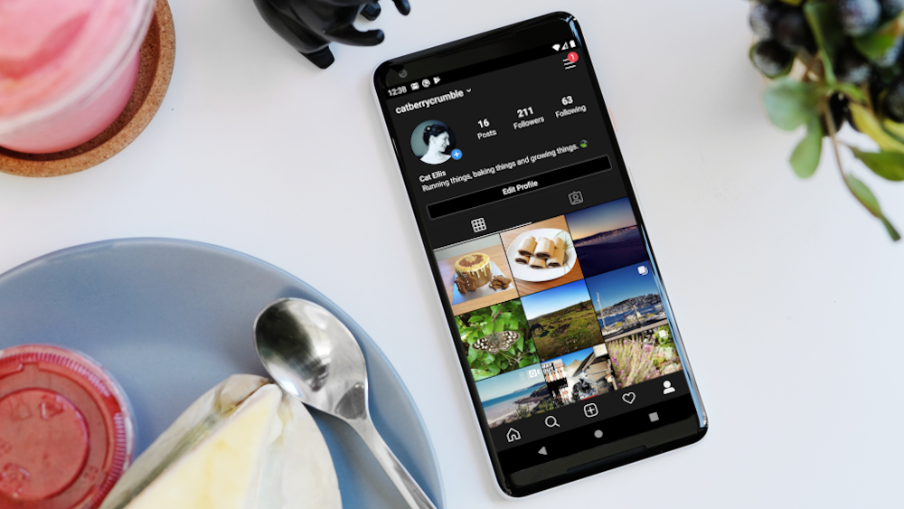
The hot new topic in terms of smartphone and computer software right now is Dark Mode, an optional system look that flips the colors of an app or operating system to make it, well, dark. Instagram has a dark mode, as does Chrome, WhatsApp, Gmail, and iOS 13, and it seems apps and developers are tripping over themselves to create a new dark mode for their software.

There's just one problem which none of these hard-working people seem to have considered that makes their work redundant, and the attention they've taken from other projects will be in vain: all in all, dark mode looks totally awful.

That's not a dig at any dark mode in particular, and no developers have implemented it particularly poorly (well, apart from Android 10). But in the rush for developers to see if they could implement dark mode on their apps, no-one asked if they should – and taken stock of how it might be reworked better rather than just following the trend.

Beyond that, there are legitimate reasons why developers shouldn't be focusing on Dark Mode. Here's why the Dark Mode craze is just crazy.

Dark Mode hurts to look at

Google Chrome dark mode

Have you ever gone onto a website, typically an older forum page from back when web design really kicked off, and seen a black background with white text (usually in comic sans) and found it totally hard to read? 

Pure black backgrounds with white font can be really hard to read, and it causes halation or visual distortion for many people. Having to look at this for long periods of time can cause serious eye strain, which means it's no wonder modern society uses white backgrounds with black or gray font for… well, everything.

Dark Mode is dark with white text, and it can cause the aforementioned eye problems. More than that, it just looks ugly, and when smartphones are trying harder and harder to look beautiful in terms of design and software, it makes no sense to create a horrible-looking dark filter.

Sure, ugliness is an opinion – but this is an opinion article, so that's to be expected.

No good for low-light

One of the main reasons behind Dark Mode (or excuses for its existence, if you're not feeling charitable) is that it's better for low-light settings, so you can use it in bed without blinding yourself or someone else. And there's merit behind that reasoning: the blue lights in phone screens have been known to stop people sleeping, as the brain misinterprets the blue light as daylight.

There's merit behind the reasoning, but not behind the execution, as Dark Mode would only be a useful way of cutting out blue light if functions to this end didn't already exist. But they do.

Many phones have blue light filters, which you can schedule to kick in at a certain time to reduce the blue light from your phone screens – typically this means between 10PM and 7AM, your phone display has a slight red hue. Some smartphones, like Sony phones, have more permanent options that let you customize the RGB makeup of your display to suit your vision.

Then there's the issue of bright lights in bed waking up your significant other (although if you're frequently using your phone in bed, that's a whole different issue). For years now, phones have had adaptive brightness, and before that you could manually change the brightness of your phone. In short, if your handset is too bright, dial down the brightness!

Dark Mode is a solution to a problem that already has a solution – and this second solution is just wasting time that developers could be spending on other projects.

Just turn it off

How to enable dark mode for Instagram

There are some minor perks to a dark mode, such as its battery saving potential. But since Dark Mode is surprisingly hard to develop (as Chrome for desktop shows), it would be more efficient for developers to work on battery optimization tricks.

Of course, the obvious response to 'dark mode is bad' is simply 'just turn it off then', and I certainly will, but there's more to the issue than that.

With every developer around being tasked to create a hasty dark mode, seemingly just because everyone else is, that means manpower is going to be turned away from other tasks that are arguably more important for the longevity of operating systems and apps.

Operating system developers are in the midst of their own battles right now: Apple's MacOS Catalina is murdering nearly every computer it touches, and Microsoft's Windows 10 is tripping over basically every hurdle it gets near.

Similarly, apps and social media platforms have bigger issues that need addressing in terms of usability: YouTube needs to sort out the algorithm that its top content creators keep getting shafted by; Twitter needs editable tweets; Instagram needs to fix its auto-ban algorithm that many have ridiculed as overzealous.

In short, developers all have problems they need to face and address, but if they spend their time creating pithy dark modes instead of fixing problems, they're letting their platforms sink further down into the plughole that the internet is becoming.


TechRadar: Photography & video capture news

Posted in Photography | Tagged , , , , , , , | Leave a comment

Best PS4 controllers 2019: the top options for smarter gaming

When it comes to PS4 controllers, we can sometimes assume there’s only one option out there: Sony’s own DualShock 4

However, despite the official controller being a dynamic and powerful gamepad, there are plenty of other choices out there if you're wanting to enhance your gameplay experience (or simply make it a bit more comfortable).

We’ve put together this list of the best PS4 controllers on the market for everyone from the casual gamer to a budding pro – and even some options for those that just want a bit of nostalgia, rather than a desperation for the right weight, motion control and sharing access.

We've rounded up the best controllers that we've tried and reviewed for our list – but also added in a couple of others below that caught our eye to give you a bit more variety and choice in the matter.

It's worth noting that you may be able to pick up great discounts on some of these controllers during Black Friday and Cyber Monday, so keep an eye on our Black Friday PS4 and PS4 Pro deals page.

If you're looking to upgrade the power of your console, then make sure you check out our best PS4 Pro deals page – and if you just want something better to play, then our best PS4 games list is, well, just perfect for your needs.

Many of these controllers are officially licensed by Sony, so you'll know they're designed to work well, but all the options on this list are ones we'd happily chuck underneath our gaming setup.

Best PS4 controllers

Sony DualShock 4 Wireless Controller (Image credit: Sony)

While we did say there are plenty of options out there that aren’t the DualShock 4, it would be hard to create a list of the best PS4 controllers without pointing out it's still the top option. 

The DualShock 4 is perfect for its purpose: sleek, small and wireless. Not to mention the built in speaker, varying light bar colors, touch pad and motion detection that enhance your gameplay experience. 

It’s also extremely simply to attach a gaming headset or headphones to the controller (unlike with the Xbox One controller). However battery life can be a pain, with the controller holding charge for around four to eight hours. 

We find it’s best to have two and always keep one charging or to invest in a charging dock so you can charge both at once (when you’re not playing of course).

We find the DualShock is a great PS4 controller for someone who just simply wants to get on with playing and isn’t fussed about bells and whistles. If you want to spice up its classic black color, then the controller comes in plenty of other colors and designs. 

Check out our full DualShock 4 controller review.

Nacon Revolution Unlimited Pro Controller (Image credit: Nacon)

If you are a PS4 player, but prefer the design of the Xbox One controller, then the Nacon Revolution Unlimited Pro Controller might be a better fit for you. Like the Vantage Controller, the Revolution Pro is built for gamers (more specifically esports) with a directional pad that can move eight ways – instead of four – alongside four shortcut buttons. 

However, it’s not quite as complicated to operate as the Vantage, nor is it as expensive.

If you want a PS4 controller with a few extra bells and whistles, but not an overwhelming amount, and prefer a chunkier controller that is a bit more resilient then the Nacon Revolution Unlimited Pro Controller could be for you. 

Check out our full Nacon Revolution Unlimited Pro Controller review.

SCUF Vantage Controller (Image credit: SCUF)

If you want your PS4 controller to have a bit more bite, and are more specific about your controller’s performance then the SCUF Vantage Controller could be for you. 

Built with gamers in mind, this fully customizable PS4 controller boasts enhanced grip, remappable paddles on the back, side action buttons and an audio touch bar. 

In other words, there are more buttons to give you control over gameplay, allowing you to specifically map controls to the extra buttons and not have to jump back in forth (in issue in some games more than others).

Essentially the Vantage controller is built so you can play more comfortably for longer but unless you know how to optimize its abilities then its maybe it's best to stick to a more straightforward PS4 controller. 

Especially because the Vantage Controller is much more expensive than your average DualShock 4.

Check out our full SCUF Vantage Controller review.

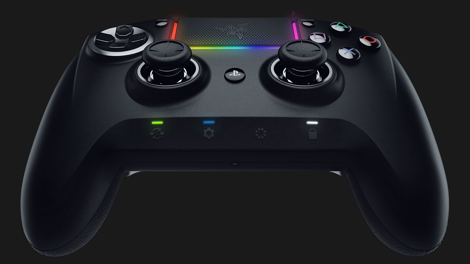
Razer Raiju Ultimate Wireless PS4 Controller (Image credit: Razer)

The Razer Raiju Ultimate Wireless PS4 Controller is more suited to seasoned gamers and pros, allowing advanced customization via the Razer mobile app – that includes remapping and adjusting sensitivity. 

If that’s not enough customization for you, you can also make use of interchangeable thumbsticks, the built-in quick control panel, and Hair Trigger Mode – allowing you to be more trigger-happy than ever before.

Much like the other pro controllers on this list, the Raiju Ultimate is chunkier than the DualShock making it more suitable for those who prefer the Xbox One controller style. 

The Raiju Ultimate is a fantastic PS4 controller, but it’s not exactly cheap. Make sure you will make use of advanced customizations before investing – but if you harness the controller's capabilities then you’ll find your gameplay experience all that much smoother.

Check out our full Razer Raiju Ultimate review.

Best PS4 controllers

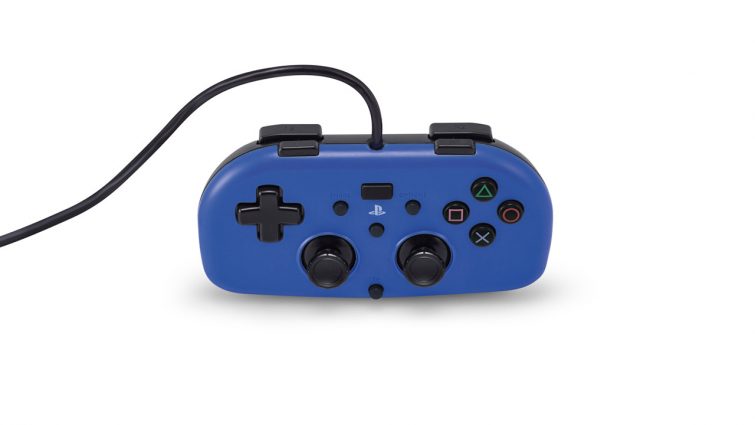
Mini Wired Gamepad (Image credit: Sony)

Looking for a PS4 controller for a young person in your house? Hori’s Mini Wired Gamepad is one we've found that would be a good ‘first PS4 controller' for kids. 

The Mini Wired looks like a retro controller, boasting easier grip, plug-n-play with 10ft cable (no pulling the console off the stand) and it’s 40% smaller than the DualShock 4. 

However, there is no light bar, stereo headset jack, speaker, dual motors, or motion sensor – it’s a much more streamlined version of the DualShock 4.

According to Sony, the Mini Wired Gamepad is compatible with “most” PS4 games. We’re reading that as the less complicated ones, so don’t fire up Assassin’s Creed Odyssey and expect the controller to be able to hack it – not that children should be playing it anyway.

The Mini Wired Gamepad is $ 30 (around £23/AU$ 38) from Sony affiliated retailers.

Best PS4 Controllers

The Nacon Asymmetric Wireless Controller is a comfortable controller that brings the Xbox One gamepad experience to PS4 (and PC) players. It's robust, classic and well-made, with a chunkier design than the DualShock 4 and asymmetrical toggles. 

It may be a better choice for those who have dexterity issues or simply prefer a bigger controller due to its bigger buttons and triggers. 

However, there are a few performance issues to take into account such as the fact the controller doesn't have motion controls – meaning you can't play games that use motion features. 

Check out our full Nacon Asymmetric Wireless Controller review.


TechRadar: Cameras and camcorder reviews

Posted in Camera Reviews | Tagged , , , , , | Leave a comment

Color in Photography for Emotional Impact

Color can be a dominant element in photography, but not always for the better. If you use color sloppily, just because it’s there, you have missed its real power. Back in the days of black and white, every image had to stand on its own merits. A red rose, for example, was not automatically thought of as a passionate shot, because there was no color involved. You had to stop and think, “What makes a rose passionate?” You had to use all the elements and principles of design to make a shot work. Technically, you still do. But when color enters into the equation, it’s very easy to let it do all the work for you.

emotion with color photography

Photo by Carol Von Canon; ISO 800, f/4.0, 1/400-second exposure.

We’ve all heard things like: “Wow, that’s a great red sunset.” Or, “I love that cool blue in your waterfall.” The question still remains — would they have liked your shot if there was no color in it? Don’t get me wrong; I’m all for color, but I consider it a great supporting actor, not the star of the show. If the only thing you can state about a particular shot is that you love the colors, then you are guilty of being sloppy with color.

That having been said, far and away the most powerful force of color is its emotional impact. In a novel by Irving Stone called “The Origin,” Charles Darwin says, “Green is the most restful and satisfying of all colors.” In that same novel, Dr. Adam Sedwick replies, “You’re right; green is the color to unravel the knots of life’s rope. Blue is colder, red more explosive, yellow turbulent . . .”

evoke emotion with color

Photo by Danny Perez Photography; ISO 200, f/5.6, 1/500-second exposure.

The first mistake that most photographers make when working with color is to assume that it is the most important factor — even to the exclusion of basic composition. I’m sorry, my friend, but that is wrong. Regardless of how vivid or exciting a color is, that in and of itself does not mean it will be a great photograph.

Ideally, a photograph should have one dominant color. Additional colors should appear subordinate to and supportive of the main color. Remember that different colors evoke different emotions. Some are positive, some are negative, depending on the viewer’s perspective. If you want to send a clear message in you image, you should strongly consider a dominant color.

emotive color photos

Photo by Max Sat; ISO 800, f/2.4, 1/90-second exposure.

As we have already mentioned, red is often associated with passion and romance. But keep in mind that it can also bring up thoughts of pain and anger. If you want to tap into the subconscious mind of your viewer, then you need to be aware of many of the associations that people have with color.

how to use color correctly in photography

Photo by Ben Pugh; ISO 400, f/4.0, 1/1700-second exposure.

For example, in the United States, the color white is often associated with weddings. A bright, colorful cheerful event, right? In Korea, white is worn at funerals. That color is associated with death. If you are a M*A*S*H fan, you will remember this lesson when Max Klinger offered his Korean bride-to-be a beautiful white wedding dress. He didn’t exactly get the response he was expecting.

how color changes emotions in photos

Photo by Greg Tsai; ISO 100, f/4.0, 1/50-second exposure.

Here is a partial list of some of the things that we often associate with different colors. Remember to keep cultural and family history in mind:

  • Red = passion and romance or violence and anger
  • Yellow = joy and intelligence or criticism and fear
color photo secrets

Photo by Chris Goldberg; ISO 200, f/5.0, 1/500-second exposure.

  • Blue = peace and harmony or fear and depression
  • Orange = confidence and energy or slowness and pain (fire)
  • Purple = royalty and religion or bruised and beaten
  • Green = growth and soothing or envy and greed
  • Black = strong and committed or evil and death
  • White = purity and goodness or cold and distant

A photograph that has a dominant color has a greater chance of sticking in the viewer’s memory—if it was taken correctly to begin with. In other words, having a dominant color will not make up for poor composition. But if you already have a winner—good composition, good lines, rule of thirds, framing, etc.—then the dominant color becomes the icing on the cake. If someone walks away from your image with a strong emotional experience (good or bad), you can consider yourself a success.

Now it’s time to go out and do it again, and again, and again . . . keep on smiling!

About the Author:
Award winning writer / photographer Tedric Garrison has 30 years experience in photography (better-photo-tips.blogspot.com). As a Graphic Art Major, he has a unique perspective. His photo eBook “Your Creative Edge” proves creativity can be taught. Today, he shares his wealth of knowledge with the world through his website.

Go to full article: Color in Photography for Emotional Impact

What are your thoughts on this article? Join the discussion on Facebook

PictureCorrect subscribers can also learn more today with our #1 bestseller: The Photography Tutorial eBook

The post Color in Photography for Emotional Impact appeared first on PictureCorrect.

PictureCorrect

Posted in Photo Techniques | Tagged , , , | Leave a comment

Balance of Canon RF 24-240mm F4-6.3 IS USM Lens Image Quality

Along with Image quality test results, vignetting, flare, and distortion test results along with specs, measurements, eye candy, and standard product images are available on the Canon RF 24-240mm F4-6.3 IS USM Lens page.
 
That said, note that this lens has some aberrations being mandatorily corrected.
 
I’ve been using this lens on my recent travels and can tell you that having this 10x zoom range mounted is extremely convenient.
 
The Canon RF 24-240mm F4-6.3 IS USM Lens is in stock at B&H | Adorama | Amazon USA | WEX
 
Rent the Canon RF 24-240mm F4-6.3 IS USM Lens from Lensrentals.
 
Please remember to support us by using our links for all of your shopping needs and by sharing the site with others!

Canon, Nikon, and Sony News, Deals and What’s New at The-Digital-Picture.com

Posted in Photo Equipment | Tagged , , , , , , | Leave a comment

Photo Books: Value and Worth in Today’s Digital World

The post Photo Books: Value and Worth in Today’s Digital World appeared first on Digital Photography School. It was authored by Adam Welch.

photo-books

Imagine the internet never existed. I know – you’re reading this while on the internet – but bear with me. As a photographer, how would you show your photographs to other people? There would be no Instagram, no Flickr, no Facebook. The reality of this fictional internetless world would leave you with limited outlets for your work. In short, you would have to find a way to physically park your photos in front of the eyes of other humans. Galleries would certainly be an option; magazines and journal publications would be another. Of course, there would be another option; the construction of a photo book.

Aside from a solo exhibition, there is perhaps no better way for a photographer to express their exact creative vision than with a well-executed photo book. Even in today’s elevated climate of digital photography, photo books have managed to keep their foothold as one of the most impactful methods of distributing photographs to the masses, all the while maintaining allegiance to the original photographs as we meant for them to be viewed.

Photo Books: Value and Worth in Today's Digital World

Photo books aren’t nearly as prevalent (or produced) as they once were. However, if you are truly serious about yourself and the photographs you produce, then a photo book might be a wonderful conduit for you to express your photographs – I know it was for me. As paradoxical as it might sound, producing photo books today has never been easier.

In this article, we’ll look at some of the reasons, methods, and considerations you might want to examine if you’ve ever felt the need for something more than just condensing your photographs into social media posts and online galleries.

But…why a book?

We’ve already touched on some of the other ways that you might present your work to the public, so why are photo books so special? Well, it comes down to control, fidelity to your original vision, and the importance you place on both.

Photographs are finite in their original incarnations, meaning there was a time when you didn’t always have to guess how your photos would appear on the different devices. Even photos in widely-circulated publications like magazines would essentially be faithful to whatever the final press copy of the image might have been.

Herein lies the immense benefit of photo books; they are an end in themselves.

Photo Books: Value and Worth in Today's Digital World

With final archival quality of inks, papers and bindings, and even the varied perception of our own eyes aside, a photo book can be your final say on how your work should look. Much like a print, the extent of your involvement in the production process of your photo book (more on this shortly) means you can virtually maintain complete discretion on how people view your images.

This means that a person in Singapore will see the same colors and contrasts a person viewing your photo in Australia, Canada, or Wales.

Three stages of producing your photo book

I’ve condensed the steps of producing a photo book into three broad sections. That being said, a book could be written on each one of the steps themselves. So, we’ll just hit the high points.

1. The inception of the Idea

Of course, this is where any photo book should begin. With some extremely rare exceptions, your photo book should revolve around a central theme or concept. It could be something you care passionately about photographing or something you want to learn more about and show the world. The weird thing about ideas is that they are notoriously fluid, meaning that even though you have a general direction to aim your energy (and your camera), you should remain open to the organic evolution of your initial idea or concept for your book.

In the case of my photo book, “Faces of Grayson,” I initially had no intention of producing a book at all. I was just a person out in the wilderness with a camera. It was only after I examined a few of my images that I instantly knew I wanted to do more with the subject matter and eventually produce a book.

Image: The photo that started it all.

The photo that started it all.

Unless your photo book is strictly for your own personal use and enjoyment, I’d suggest that you don’t approach your idea for your photo book in retrograde. It’s likely not a good practice to simply go through all your photos and force yourself to find a common theme. If you begin with a solid idea that you care about, you’ll ultimately end up with a more cohesive finished work.

We’ll talk a bit more about the actual shooting and choosing of the book images in the next section.

2. Compiling the images

We’ve touched briefly on how it’s usually not advisable to base your photo book on photos already in your image archive. It’s just not a good idea. So, once you’ve decided on the subject of your photo book, approach the acquisition of your content with a Zen-like state of relaxation. Don’t force the work, and don’t force yourself to produce the work quickly.

With that said, pay careful attention that you don’t forget that these images are specifically intended to be part of your photo book. You should always keep the overall theme, feel, and concept in line with your original idea even if that idea evolves along the way.

Don’t rush things

For my photo book, I shot images for roughly two years. In the end, I had a multitude of photos from which I could choose the absolute best.

There is no time limit for obtaining your images. Please, please, PLEASE don’t rush yourself. A rough estimate of when you would like to see your book finally come to life is perfectly healthy. Conversely, subjecting yourself to a self-imposed “deadline” is not. So if there’s one piece of advice I could give when it comes to shooting the photos for your book, it would be not to rush. Instead, be deliberate, take your time, and get it right the first time.

Sequencing your photos

After you’ve completed the principal photography work for your book, it’s time to put it all together. Ask yourself a few questions: Is your book a narrative? Does the story you want it to tell depend on the order of the images?

Some photo books work very well with sequential arrangements based on the chronology of time and the progression of the subject matter through that time. If this is the case for your photo book, then make sure how you assign your images to the pages conveys this dynamic to the viewer.

If your book is not a narrative and instead is more of a compilation of place or subject with no need for sequential ordering, then the arrangement of the photos become less important. However, it should still remain a focus of great consideration.

Photo Books: Value and Worth in Today's Digital World

Once you have completed the task of choosing and sequencing your photos, it’s time to choose layouts and fonts, image sizing and orientation. Also, chooses the amount of supplemental textual narration you wish to include (or not include) with the images.

The majority of this will be left to your discretion unless you conscript outside help from a designer. Deciding on the final flavor of the book is the most difficult and most exciting aspect of putting together any photo book.

3. Printing

All right. This is where things get truly slippery. You’ve completed work on obtaining the photos for an idea that you absolutely love. The images are outstanding, sequencing is beautiful, and you know every last detail of your final grand vision. It’s all going to be perfect!

Well, I’m sorry to break it to you…

It won’t be.

Yes, I know. That truth hints at an underlying pessimism, but it’s intended to be constructive. You see, the key to sustained success with your photography is to maintain a realistic handle on your expectations. If you enter the printing process believing nothing will go wrong, and there will be no unforeseen challenges, then you will be quite discouraged when these inevitable issues arise.

Now that’s out of the way, let’s look at some common (but not all) options you might have for getting your photo book printed.

Photo Books: Value and Worth in Today's Digital World

Print-on-demand

A commonplace service in the literary world, the print-on-demand model is perhaps the easiest and most cost-effective method for getting your photo book published and printed. It also involves the least investment on your part in terms of personal control.

Print-on-demand means just what the name implies; you provide the finished content design, and a printer/publisher/distributor will print a copy of the book each time a copy gets ordered. This is a wonderfully cost-effective way to print small or large numbers of your photo book with virtually no waste. Your book gets printed only when there is an order. Often this method also includes a free ISBN and other perks.

This is also a great option to get your photo book printed and sold with as little overhead as possible. However, there are some downsides to this process. Namely, you will have little or no creative control over paper types, bindings, inks, and other nuances of the book printing process.

Amazon, Blurb and a growing number of other well-known book merchants have begun offering these types of services to photographers wishing to get their photo books distributed to the masses. For users of Lightroom, you can design and send your book to Blurb direct from the Lightroom software too.

Traditional book printers

If you want to go big with your photo book endeavor and have the financial (and marketing) resources to sit at the table, then you might be interested to know that even independently published photographers can have extremely high-quality photo books printed which offer enormous creative control over virtually every aspect of the printing process. This means that you will usually be able to select paper types and binding materials along with physically proofing prints so that your photos look exactly the way you want them to display.

Photo Books: Value and Worth in Today's Digital World

Unfortunately, this isn’t always the most forgiving option for those who are creating their first photo book or have limited means for producing their published work. It involves the willingness to exercise ultimate creative judgment on all aspects of your book, which can be highly stressful. Furthermore, the majority of these types of printing firms have strict minimum printing runs for all printed books.

So, unless you need and are ready to store and distribute upwards of 1,000 copies of your book, this might not be the best route for your project. At the same time, if you do have the logistics in place and the demand is high enough for the quantity involved, the per-copy price of high-volume printers like these translates to relatively attractive profit margins when you consider the quality versus the cost of the product.

I went via this route with my first photo book. It involved organizing an overwhelmingly successful Kickstarter campaign along with a highly aggressive marketing strategy to source the funds I needed to cover the cost of printing. Would I do it again? Honestly, probably not, at least not this way, which brings me to our next option.

photo-books

Limited quantity printing

If you’re looking for a careful balance between precise creative control, costs, and volume, this is likely the best choice for your photo book.

You could easily call this printing method could easily “artisan” printing. It involves a low number of meticulously crafted books, often with finely curated materials and craftsmanship, which can be purveyed more as a personal statement than a mass-produced product.

Limited quantity printing is perfect for face-to-face marketing, where the photo book itself becomes an art piece. Printing costs are relatively high, so in most cases, quantities of twenty or more copies could become slightly awkward. However, books of this nature can demand higher sale prices from collectors and impassioned patrons, and rightfully so.

Value in the effort?

It might be difficult to believe, but there is so much more to say about the in’s and out’s of making a photo book; at least one that you intend to make for the enjoyment of others.

A photo book is more than just making photos and finding a way to bind them into pages. Is it worth it? Does the reward justify the risk? It depends. Have you felt strongly about your subject and feel equally compelled to make photographs of that subject which you then work to compile into a photo book? If so, you’ve already committed a piece of yourself to the project. Anything that carries that much personal investment is, by definition, a success.

So, yes, there is still value in photo books. In a sense, books such as these carry even more value today. We live in a world saturated by the instantaneous. Producing a photo book requires time, deliberate intent, and the willingness to slow yourself down to focus on your true goal.

Will your photo book sell a million copies? Well, it’s doubtful.

However, depending on your expectations, making a photo book could very well be the most memorable, rewarding, and ultimately challenging mission you ever undertake as a photographer. There truly is no other feeling than seeing your own book sitting on your shelf. Believe me.


The post Photo Books: Value and Worth in Today’s Digital World appeared first on Digital Photography School. It was authored by Adam Welch.


Digital Photography School

Posted in Digital Photography | Tagged , , , , , , | Leave a comment

Google Home devices bricked by latest firmware update will get replaced

Numerous reports of bricked Google Home and Home Mini devices began to emerge from users on Google's forums and Reddit (as spotted by Android Police) over the last month. To Google's credit, the company was quick to acknowledge the problem, and it now says the cause has been discovered and will be rolling out preventative measures shortly. 

According to a statement released to 9to5Google, the search giant narrowed the issue down to an error in the automatic firmware update process, which resulted in some Google Home owners experiencing unresponsive units with all four LED lights constantly lit up.

"We are aware that a small number of Google Home and Google Home Mini devices are affected by an issue that causes the device to stop working," began the statement. 

It continued, "We have a fix that will prevent the issue from happening and will be rolling it out soon."

Of course, the fix won't help those users whose devices are already affected, but thankfully Google also promised it will be "replacing affected devices", even if they're already out of warranty.


TechRadar: Photography & video capture news

Posted in Photography | Tagged , , , , , , , | Leave a comment

4 Ideas for More Creative Shots when Photographing from One Position

The post 4 Ideas for More Creative Shots when Photographing from One Position appeared first on Digital Photography School. It was authored by Lily Sawyer.

ideas-for-more-creative-shots

4-creative-shots-ideas-shooting-in-one-place

This year, as has been the case in the past few years, as a family, we take a few days in the summer to go camping. I’m not going to lie; I find camping really tough. I don’t like the inconveniences camping requires but I do love the campfires and stargazing. This year has been particularly difficult as we went during a heatwave. The heat was relentless, and during the day we couldn’t even stay in our tents. We had to seek shelter in the forest for hours when not going on a long walk.

This article came to me on one of those mornings finding respite from the heat in the forest. My kids were drawing, sitting on the swings, hacking a path through some bushes, and I sat on a picnic blanket with my camera. I gave myself the maximum space of the mat to move around in, approximately 1.5m square. All I had with me was my Nikon D610 and a 60mm micro prime lens, so I gave myself a challenge. What can I photograph creatively whilst glued to this picnic mat?

4 ideas to get more creative shots when restricted in space and position

1. Direction and perspective

To get more creative shots, look at different perspectives. Here I lay down and looked upwards at the branches and leaves above me against the sky.

4-ideas-for-more-creative-shots-shooting-in-one-place

I tried to find more interesting compositions given the limited subject matter. Also, I tried to find layers of branches to achieve some bokeh and depth of field and focused on the nearest branches above me.

4-creative-shots-ideas-shooting-in-one-place

I moved around the mat while still on my back, and took shots with the tree trunks as leading lines reaching up to the sky for interest whilst still looking upwards as pictured above. Then I looked down and took some close up of twigs on the forest floor as pictured on the right below.

4-ideas-for-more-creative-shots-shooting-in-one-place

Look both directions: left and right.

To my left was this tree (pictured above left). I used the forest floor to create foreground interest, some greenery as the middle ground (which was focused), and the big tree in the distance as the background. To my left was a big tree trunk covered in moss and knots, both of which I found an interesting subject to take close-ups of.

4-ideas-for-more-creative-shots-shooting-in-one-place

This is what I love about this micro/macro lens. When you shoot close up, even at small apertures, you still get really pretty bokeh. So, I leveraged this and used the distant leaves and the sky to achieve bokeh behind the mossy trunk.

4-creative-shots-ideas-shooting-in-one-place

2. Distance

For more creative shots, take your gaze further and see what’s on the horizon. Below is the furthest view I could see.

4 Ideas for More Creative Shots when Photographing from One Position

To the left of this tree trunk is the tall spindly white tree that dominated my distant scenery. I thought this was a rather unusual tree and made for a good, strong subject. It stood out from the lush greenery as if constantly growing its way into the sky.

4 Ideas for More Creative Shots when Photographing from One Position

Also, don’t forget to check what’s right in front of you – especially anything that could be close-up material too. Below-right is a cut off tree shot at normal eye-view distance. I put a little leaf on top, so I had some close-up material to play with.

4-ideas-for-more-creative-shots-shooting-in-one-place

This trunk below was too far for me to reach or do a close-up of so this was my “midway” subject to photograph. Again, I used the foreground and background to create some interesting bokeh.

4 Ideas for More Creative Shots when Photographing from One Position

3. Create a new subject matter

Whilst it’s good to use our observational skills to find interesting things to photograph, we mustn’t solely rely on what’s already there! Get creative and think of unusual out-of-the-box ideas you can put together as your subject matter.

Here I happened to see heart-shaped leaf just outside the blanket I was sitting on, so I created a ring of seeds around it. I liked the way the colored leaf pops out of the brown earth.

4 Ideas for More Creative Shots when Photographing from One Position

Our picnic was laid out on the blanket and wondered what I could do with an empty water bottle. I photographed it looking through the hole at the top into the bottom of the bottle.

4 Ideas for More Creative Shots when Photographing from One Position

4. Experiment with effects

We had some plastic from our picnic stash and I used it to create a soft-focus effect on this landscape shot of the tree. I achieved this by wrapping the plastic around my lens, so it covered a little bit of the lens around the edges. Doing so, rendered those areas soft whilst the rest of the tree is still in focus.

4 Ideas for More Creative Shots when Photographing from One Position

I played around with how much or how little of the plastic I wanted to obscure the image. This one below had more soft-focus leaving only the strip of horizon sharp and clear.

4 Ideas for More Creative Shots when Photographing from One Position

I tried recreating a tilt-shift effect.

Tilt-shift lenses are called so because you can rotate, tilt and shift the lens optics in order to blur parts of the image whilst leaving other parts sharp if you wish. This is a neat trick when trying to photograph miniatures. I asked my daughter to create a little miniature teepee for me. These are my attempts whilst shifting the positional angles of my lens as I was still using the 60mm micro and not a tilt-shift lens.

4-ideas-for-more-creative-shots-shooting-in-one-place4-ideas-for-more-creative-shots-shooting-in-one-place

This was a fun little challenge for me and got me out of boredom and into thinking creatively! I hope you enjoyed this and will try it sometime!

If you have any other ideas for more creative shots, share them in the comments below!

4 Ideas for More Creative Shots when Photographing from One Position

The post 4 Ideas for More Creative Shots when Photographing from One Position appeared first on Digital Photography School. It was authored by Lily Sawyer.


Digital Photography School

Posted in Digital Photography | Tagged , , , , , , | Leave a comment