When I wrote about making dramatic images using shadow and contrast, a reader rightly pointed out that a couple of my photos were also good examples of color contrast.
This is interesting because it shows how two photographers can look at the same scene, and see different things. In those examples I saw textures, shadows, and tonal contrast, and instinctively converted them to black and white. But another photographer might place more importance on the strong colors, and make them the centre point of the composition.
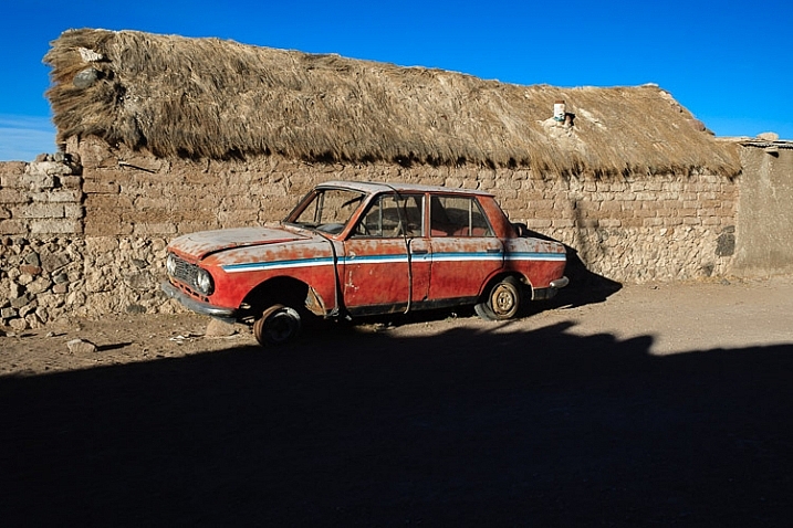
Here’s the first of those images. The color contrast here is between the orange car and the blue sky.
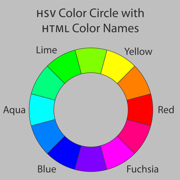
If you look at a color wheel, used by artists and graphic designers to show the relationships between colors, you will see that orange and blue are on nearly opposite sides. They are said to be complementary colors (as opposed to analogous colors, which are close to, or next to each other on the wheel).
Using contrasting colors in a composition nearly always results in a strong image. The key is to keep the composition simple, and not to overwhelm it with too many hues.
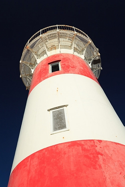
Here are a couple more examples. The first shows dramatic red stripes on a lighthouse against a dark blue sky (I used a polarizing filter to intensify the colors). Red and blue are also nearly opposite on the color wheel.
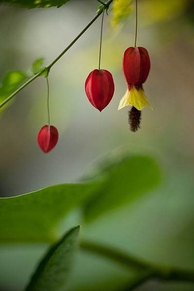
The second shows red flowers, against a green background.
These three color combinations – orange/blue, red/blue, red/green – occur a lot in both natural and man-made environments.
Below is the second photo from the earlier article, mentioned above. It uses a different type of color contrast. The green apples are displayed against a grey background. The lack of color in the background makes the green of the apples seem more intense than it is in reality.
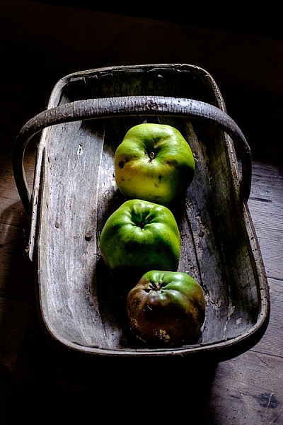
This technique of placing a colored object against a dark or neutral background is another that you can use over and over. It’s very effective. Here are two more examples.
The first shows a work created by artist Chris Meek. The grey background emphasises the yellow paintwork, the only strong color in the image.

Image used with the permission of the artist
The second shows a display of pumpkins. The dark grey background emphasizes the intensity of the orange hues.
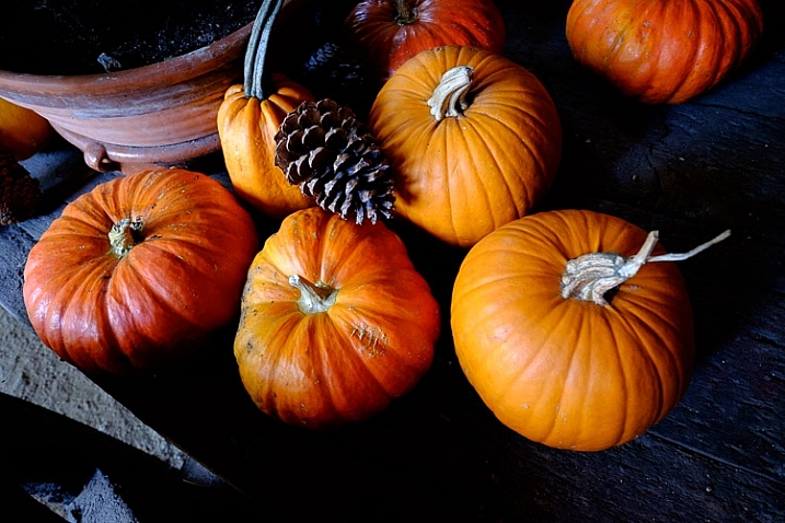
The key here again is to keep the composition simple. Imagine each of the previous examples with a splash of red in the image somewhere. The red would pull your attention away from the dominant colors, and diminish the impact of the composition.
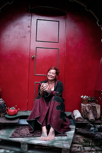
Another approach to using color contrast is to look for scenes with a limited color palette. Here’s an example – the image below is a portrait of a friend of mine, sitting in front of a gypsy caravan, that she made herself. The image is full of color, but they are mostly shades of two different hues – red and green, which we know are near opposites on the color wheel.
Here’s another example. It’s a colorful image, but again there are two dominant hues – blue and red. The incongruity of the plastic sleeves the chef is using to protect his arms, combines with the color contrast to make a strong composition. The colours are more muted than the earlier examples with this color combination, but it still works.

The images in this article have several things in common: strong use of color (in different ways), simple composition (simplicity often equals strength in design), and good observational skills.
It is is one thing to analyze these things in photos, it is another to train yourself to see them. To do so, you really have to think about the scene in front of you. What colors do you see? Does the light suit the subject? How can you simplify the composition to make those colors stronger? If you can figure out the answers to these questions, your images will be stronger.
Do you have any questions about color contrast, or any photos to show us? Please let us know in the comments below.
Mastering Composition
 My ebook Mastering Composition will help you learn to see and compose photos better. It takes you on a journey beyond the rule of thirds, exploring the principles of composition you need to understand in order to make beautiful images. You’ll also learn how to use colour to create photos like the ones in this article. Click the link to learn more or buy.
The post How to Create Strong Compositions Using Color Contrast by Andrew S. Gibson appeared first on Digital Photography School.
