Composition and good photography go hand in hand. Anyone can (with practice) perfect the technical skills to take a well exposed photo. It’s your flair for composition that will set your photos apart from the crowd.
The difficulty is, while technical photography can be taught using concrete rules and numbers, composition is a little more ‘artsy.’ A lucky few are born with a natural sense of visual style and balance. For the rest of us, it takes plenty of time and experience to develop a talent for composition.

“Allegro North Peir at Sunrise” captured by Coy Aune
Luckily there are a few tips and guidelines that can make the whole thing easier. One of these, the Rule of Thirds, I have already mentioned in a couple of previous articles. There is another principle of good composition that can add real impact to your photos; it just doesn’t have a name.
Today I want to write about using straight lines in a composition to lead the eye of the viewer. This is a simple technique that helps to control the way the viewer sees your photo. You can use lines to lead the eye of the viewer within your composition, and even add impact to a particular part of your photo.
Imagine a photo with a panoramic landscape. You could think like a tourist and just snap the landscape with no thought for creative composition. But as a creative photographer, you have a better idea. You find an outlook that offers the same scene, but with a fence in the foreground.
For your first shot, you photograph the fence running horizontally across the foreground. In this situation, the fence is like a barrier between the viewer and the subject. It does not help the composition; in fact it’s probably an annoying distraction. People are likely to think, “Nice photo. It’s a pity the fence got in the way.

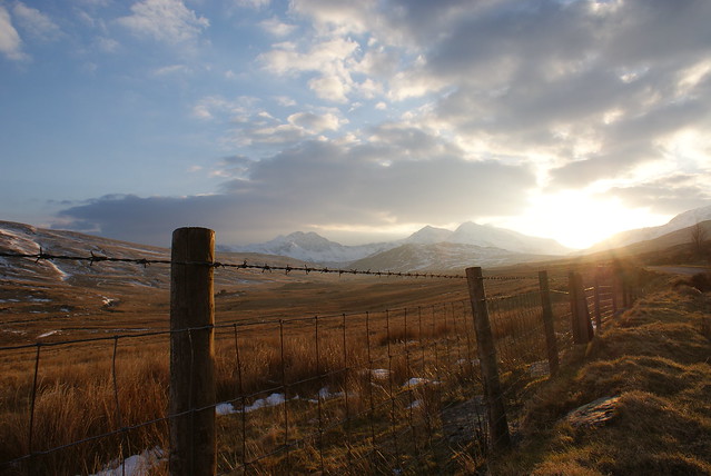
“Snowdonian sunset” captured by Philip Male
Next, imagine the same scene shot from a slightly different angle. Now the fence runs diagonally away from the camera toward the landscape in the distance. This alternate view (if done well) will create a completely different impact. The eye will be caught by the prominent subject in the foreground (the fence), and it will follow the line of the fence posts into the picture.
In this way the two elements of your composition work together to make a stronger picture. The fence is no longer a distraction; in fact, it adds emphasis to the background subject by leading the viewer in that direction.
There are many situations that can use this simple technique. A bridge, a jetty, a line of telephone wires, even railway tracks. There are all kinds of opportunities to use the lines of everyday objects to enhance a composition.
There are three things to look for when using straight-line objects.
- The lines should be long (a line of two fenceposts won’t do much for your photo; twenty fenceposts will).
- They should be receding diagonally away from the camera (remember our example).
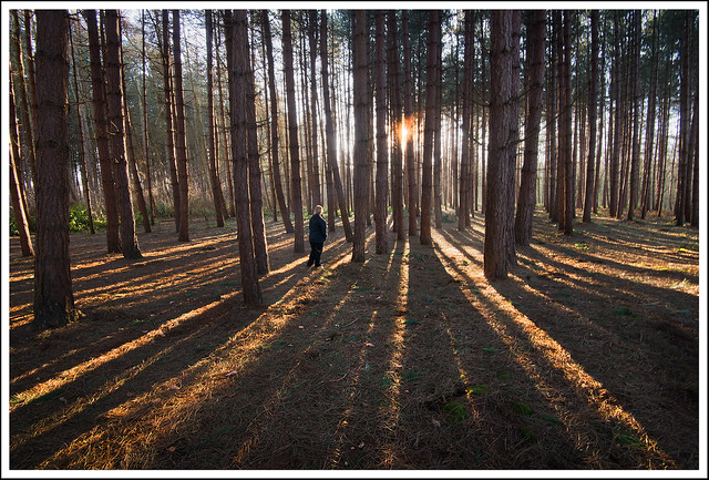
- And it helps if there is a repeated pattern in the lines which diminishes as the object recedes away from the camera. In our example, the fenceposts will appear to get smaller as they progress into the distance. This will create a sense of perspective that makes your two-dimensional photo seem quite three-dimensional.

“Forest lines” captured by Stephen Bowler
Whenever I teach a photography class, there is a simple rule that I try to get across:
Anything that doesn’t make your composition better makes it worse.
A photographer in our hypothetical scenario should be applauded for choosing to use the fence to add interest to the landscape. After all, most good landscape subjects have been photographed a million times before, so the trick is to look for a more interesting angle. But having decided to use it, it is essential that the fence works with the rest of the composition. Otherwise, your picture may be better off without it.
As a creative photographer, always remember that nothing should appear in your photo by accident. All the elements of your photo should not only add interest, but also work cohesively to add impact to the entire composition.
About the Author:
Andrew Goodall writes for http://www.naturesimage.com.au and is a nature photographer based in Australia. He manages a gallery in Montville full of landscape photography from throughout Australia.
Go to full article: Leading Lines in Landscape Photo Composition
What are your thoughts on this article? Join the discussion on Facebook
Article from: PictureCorrect