How compositional rules can help or hinder your composition
Creating good photographs, and becoming a good photographer, is in general, not just about learning about your camera and all the rules of composition. These help, but while you should know your camera and have a good knowledge of technique, the biggest challenge you need to give yourself is learning to expand your perception, of the world and learn to see the world as it really is. Our minds are basically full of distractions – endless thoughts about our needs, wants, and to do lists. It’s a bit like living in a bubble which you need to break out of, so that you are fully able to see what’s happening around you, and not be distracted by your mind.

“It takes a lot of imagination to be a good photographer. You need less imagination to be a painter because you can invent things. But in photography everything is so ordinary; it takes a lot of looking before you learn to see the extraordinary.” – David Bailey
I think the rules of composition, and in particular the Rule of Thirds, are a great way to develop your perception. It’s not a rule you should learn and then overlay on all of your images, or your view of the world.
For me rules are a way to train your eye, so that eventually you can unleash its wild creativity. The creativity that is totally unique to you and exists in no other person.
Rules of composition:
- Do work and help you create excellent compositions – but don’t use them all the time (don’t use anything all of the time)
- Help you develop your perception and train your eye to see the wonders of the world
- Create harmony between your subject and its setting
My philosophy with rules is always, “Learn the rules like a pro, so you can break them like an artist.” (Picasso said that by the way, not me).
Use them like a tool box
I like to think of the rules of composition as a little tool box that you can draw from in different ways, and in different variations. They aren’t always necessary, but they are super useful for helping your mind be both disciplined and focused, as well as creative, free, and wild.
So – what is the Rule of Thirds?
I love the rule of thirds because it’s a very simple, and easy concept to understand. It’s one of the key compositional rules (others include: leading lines and natural framing) that many photographers use to enhance their compositions. Although it can be tricky initially to bring it into your photos, once you start composing using the Rule of Thirds, it will immediately give your photographs a feeling of flow and depth; as well as helping them look balanced, creating an easy path for the eye of the viewer.
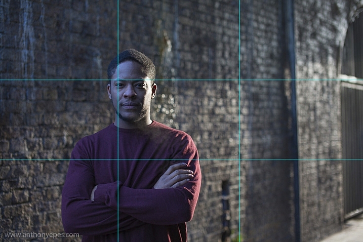
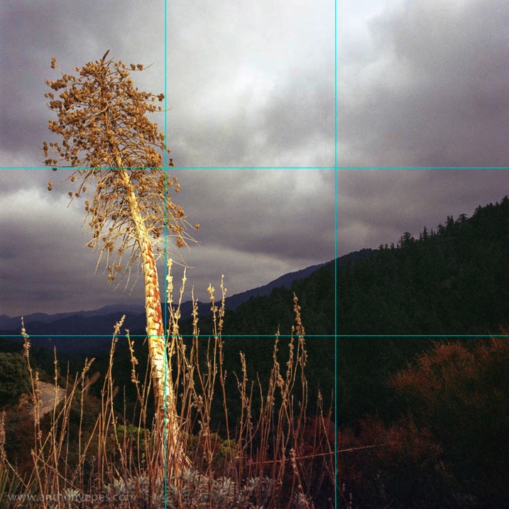
The rule of thirds breaks the image up into nine equal squares. Where the lines intersect we call these Points of Interest. The rule works by placing your subject, and other elements, along the lines and at the points of interest. Most cameras will have the option to overlay this grid on the viewing screen, so turn it on if that helps.
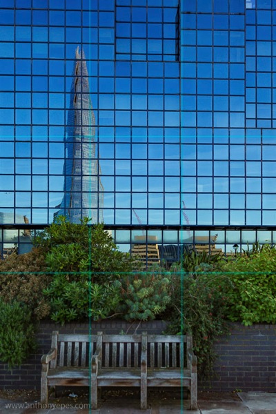
The human eye is naturally drawn to the these points of interest. It won’t generally look in the centre of an image first, unless there is a particularly arresting subject drawing the eye there.
Why use the rule of thirds?
Generally placing your subject off-balance, then using one, two or several other elements within the frame, placed at the points of interest, creates a much more visually appealing photo than having your subject dead centre. It:
- Creates balance
- Adds more complexity to an image than just placing your subject in the centre
- Creates energy
- Gives your photo a sense of depth, rather than just being a flat image

What’s very important also, is that you have one or two other elements within the frame that balance or create energy, tension or harmony with your subject. It’s not enough to just have your subject off-centre. Let’s look at some examples.
Let’s start simply. Rule of thirds can be applied to your horizon line. Don’t put it in the middle, use it to run along the top or bottom third of the image:
This is more unusual to do than you imagine. Of the thousands of photos I have with a horizon line only a handful are not running along the centre of the image.
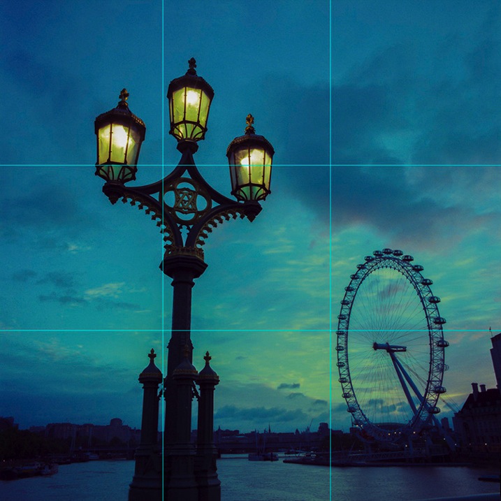
With every technique you use, there has got to be a reason for doing it. Otherwise you just see technique. I used it in the photo above (at the top of the article) because the clouds and sky were so much more interesting than the foreground, and below, because the light on the water was beautiful.

You can also apply the idea of having lines run along the upper or lower third of your image to things other than the horizon. Here I’ve applied it to some well organized rubbish bags. Notice that the line of bags follows the bottom horizontal line, but that it’s also emphasized by the line of the pavement and double yellow line at the bottom? These elements create energy – giving it perhaps a sense of movement and flow. Then you have the vertical lines and brickwork patterns as a contrast. All of this order of lines and patterns are very pleasing to the eye. The mind is always looking for order within the chaos of the world!
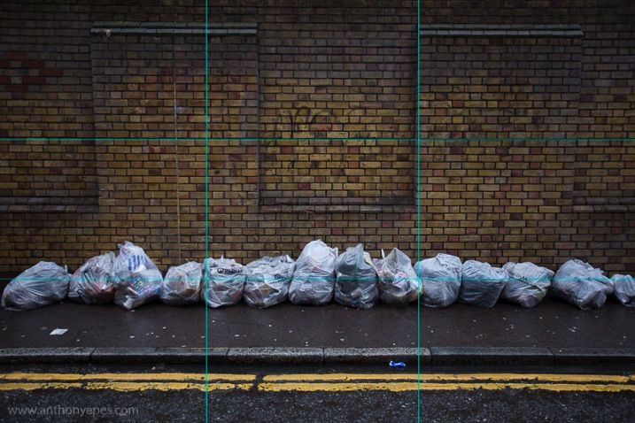
It’s important to say that I am not walking around looking for pictures that fit into the rule of thirds, or any of the other composition rules. But when I find a subject I’m interested in (I believe passion for your subject is the most important thing in your photography) and I am composing, looking for elements etc., then that’s when the rules are really helpful. Once you really get familiar with the rules, then you can start to adapt them to your own creative vision.
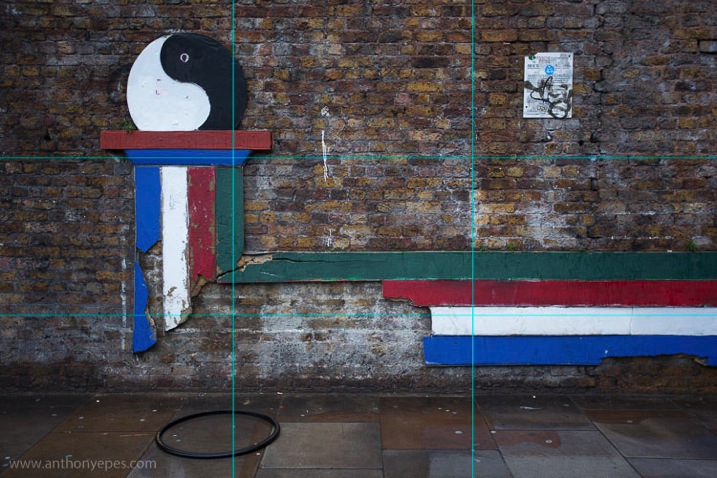
I have a passion for urban decay, you might call it. In the image below, instead of placing the ball and the column dead centre, I placed it in the left third of the frame. The other elements that are balancing it out are the ring on the floor, the lines going horizontally along the image, connecting with the points of interest lines, and then in the top third of the photo we have the notice on the wall. Take away the notice and the ring, and you’d have a much plainer, less interesting image.
Below is one of my favourite photos of London. Here you have the old street lamp hitting the two left hand points of interest, and the wheel of the London Eye in the bottom right corner. You could say that there are only two elements in this photo – a primary and a supporting secondary in juxtaposition. The street lamp being the primary element is placed on the first third and is without a doubt the main subject. But by adding the London Eye as the secondary element we now have a sense of place, and the relationship is complete. It says, “This is London!”
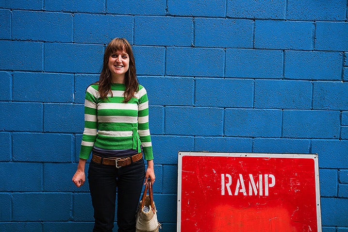
I like that the third element in the image below is the blue background, which helps the image feel clean. But because of the balancing elements of the woman and the sign, it’s not overly simple.
In the photo below is a rough adherence to the Rule of Thirds. Can you see where I placed the elements and why? Do you think this was the best way to compose the image? What’s important for me is that it’s not just a photo of a skeleton – it’s a photo of a skeleton in a very beautiful place. I find that lots of photographers will get absolutely mesmerized by their subject and start taking photos before absorbing the whole scene (you know that time when you get your images up on the computer and wonder why they don’t look as great as you thought they were going to, this is often due to not taking in the whole scene).
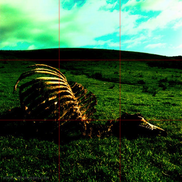
A very interesting skeleton it is, and unusual to come across. But there is also the element of perspective and the upper third being an almost ethereal sky. If you take away the sky the photo wouldn’t pop, would it? By placing the subject nearer the lower third I’ve created space for it to rest in.
Rule of thirds will help you capture beauty
Most people are able to appreciate, and see, the beauty and harmony of nature on a large scale – that epic view of a sunset over a beach, the vast meadow of beautiful flowers. But when you put a camera up to your eye, and reduce an image to a much smaller scale, I think most people lose that ability to see the harmony of the world, and thereby its beauty. The rule of thirds will help you see how to create harmony and balance within your photo, by helping you when you are placing your elements within your frame.
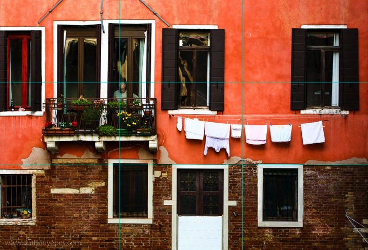
And now to Venice. This photo below is a bit more complicated, but let’s look at what elements are the most important. The man, definitely. He is bang on one of the points of interest. Now notice how the change of colour and texture of the building runs along one of the lines.
There is some of the structure of the rule of thirds but that’s not the whole story here. So you can use elements of the rule of thirds and then add in your own ideas and elements. It’s all flexible. Play with it.
Let the rules help you be excellent
You can sometimes use the rule of thirds to almost repair your image, by cropping. All processing programs will have the grid available, and I know that some photographers will overlay the grid and crop their image to fit these rules. I am not a fan of any kind of regular cropping. Why? Because I think in general it makes you a lazy photographer. Don’t rely on anything after the fact to make your photo better, when you can capture something in-frame now. By all means use things to enhance an already good photo, but no bad photo can be saved in post-production.
But – if you love post production, and you want that to be what defines your images, that’s fine. But become awesome at that, be excellent. What unifies all photographers who are taking consistently excellent photos is they are committed to excellence in their own way. That I can get behind.
We all come to rules differently. I’ve noticed in my workshops that not everyone has an affinity for absorbing rules, and putting them into practise. Maybe the idea of a more technical basis for your photography makes you squirm. But I would really encourage you to stick with it. Even if it takes a while for you to absorb this, the technical aspects of photography really give you a good grounding, so that you have the ability to take the photographs that you see in your mind’s eye.
If you are more of a technical rules-based person, my advice is to try and propel yourself away from the rules. I’ve noticed that people who get too involved in rules of composition, and their camera buttons, often find it difficult to really see what’s going on around them. So learn the rules, but then really push yourself to see beyond them.
So go explore and take the rules with you. Learn them, play with them and have fun.
The post The Rule of Thirds – How it Can Help or Hinder Your Composition by Anthony Epes appeared first on Digital Photography School.