As soon as humans discovered that it was possible to capture black and white tones in a photographic image, a practical means of color photography was sought by those who dreamed of harnessing the full spectrum of visible light. Some of the very first photographic color experiments began in the mid-19th century with scientists trying to discover a material that could capture the color properties of the light that fell upon it.
In 1886, physicist and inventor Gabriel Lippmann created what was to be the first color photograph without the aid of any pigments or dyes. By 1906, Lippmann exhibited his process along with color images of a parrot, a bowl of oranges, a group of flags, and a stained glass window. His discovery earned him the Nobel Prize in Physics.
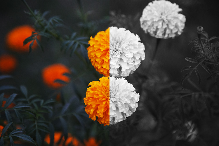
But Lippmann was onto something else in his experiments. Selecting subjects for his photographs that are not only inherently colorful but are also strongly associated with color within the human brain. Perhaps without realizing it, Lippmann was one of the first photographers to draw a line between color and black and white photography. Deliberately selecting subject matter that was exemplified by radiant colors to reproduce in a color medium.
Nowadays, digital photography grants photographers with both the blessing and the burden of being able to choose between color or black and white in post-production. It can often be a painstaking process deciding between the two. Although making a deliberate decision between a color or a black and white image is a skill that requires practice and trial-and-error, ultimately the choice is down to you, the individual.

However, there are a few points to consider if you find yourself stuck between the two. Here are the top six tips for deciding whether to go with color or black and white.
#1 Color Relationships
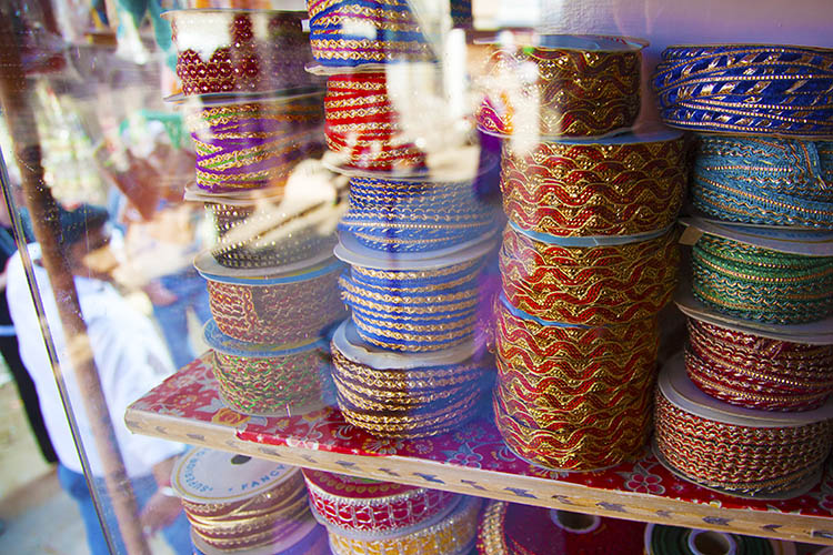
The first thing to consider when choosing between color or black and white is in fact, color itself! Ask yourself; what is it that draws you to the image? If you find that the relationship between distinct hues in your image are important, color is your best bet. Color doesn’t always translate to a black and white image successfully. An image with contrasting hues such as red and green often appears similar in tone in a black and white conversion, making for a less striking or muddy image.

#2 Mood
Just as artists have used color in paintings to denote mood for centuries, the colors in a photograph can also create the emotional atmosphere of an image. Color is a powerful messenger. It can impact a viewer’s emotions, draw associations between ideas, and guide the eye around an image.
While black and white images generally evoke a sense of sensuality or seriousness due to its association with documentary photography, color can emphasize a feeling of joy or sadness depending on the color scheme. Just as we associate warm colors like red and orange with comfort and warmth, so do we relate to the colors in a photograph, giving the viewer clues about the image and creating a more immersive experience.
The tone or color balance of a photograph can point to a time of day or season which conveys a particular emotion or experience within the image. Black and white photographs appear to be more timeless than color images because they are free from color schemes associated with particular types of film, processes, or trends in digital processing. Black and white photojournalism is often hard to date with a cursory glance, so the subject matter remains relevant to the present day.
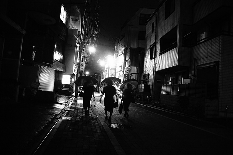
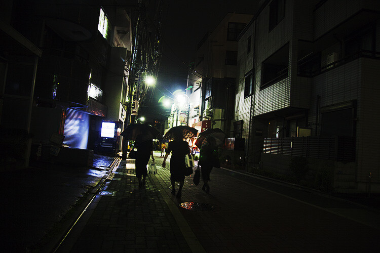
See how the color version has a completely different mood?
#3 Attention
We see it all around us in marketing, architecture, and print. Color is used to grab a viewer’s eye and draw them in. But it is a fine balance and can often become complicated or convoluted if too much is happening with the picture. Look for a dominant color or color combination in your work. The most visual impact is often created by either isolating a particular color or having two colors from
The most visual impact is often created by either isolating a particular color or having two colors from well-separated areas of the color spectrum included in the one image. Colors such as red and green, or orange and purple (complementary colors) play off each other when they reach the human eye and create a sense of movement and action.
If your image has these combinations it might be better to stay with color and spend time emphasizing the colorful components of the image rather than converting it to black and white. A lack of color accentuates the light and shadows rather than eye-catching color combinations. Emphasis on particular colors can also be useful in forming a cohesive body of work, using color to contrast different imagery in a series, or uniting each piece with harmonious trends in color schemes.

#4 Viewing time
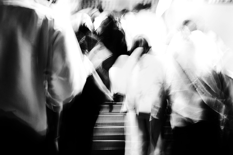
Many photographers prefer black and white images for their tendency to distance the subject matter from reality. In documentary photography, the reverse is also true as humans see the world in color, and a rendition of the world in monochrome gives us pause to investigate. In both cases, removing color from a picture helps the viewer to focus on what is happening in an image. Due to the lack of cues that we naturally look for in color imagery, the viewer tends to look at a photograph more closely to ‘read’ what is happening in the image. A slower viewing time means that there is more time for the image to communicate with the viewer, impart emotion to a greater extent and perhaps stay with the viewer even after they have stopped looking at the work physically.
Due to the lack of cues that we naturally look for in color imagery, the viewer tends to look at a photograph more closely to read what is happening in the image. A slower viewing means that there is more time for the image to communicate with the viewer, impart emotion to a greater extent, and perhaps stay with the viewer even after they have stopped looking at the work physically.
#5 Content
To put it simply, black and white images create an emphasis on light, form, or texture. If the content of the photograph is more important than the color of the subject, or you feel that the color in a photo serves only as a distraction from the message you want the image to convey – then black and white is probably a good choice.
The focus shifts from colors to tones in black and white. So subjects like smoke, shadows, subtle changes in light and dust become more obvious in a black and white image. Because of our associations with these subjects and their otherworldly appearance, a sense of drama can become more apparent in a black and white image than that of a color image.

#6 Simplicity
Often a color photograph looks too busy or convoluted if it has too many colors going on at once. Sometimes converting the image to black and white is a way of separating those tones out into an image that is easier on the eye. Images with a wide range of tonal values tend to work well for black and white imagery. As well, most black and white images work best when there is a definite range from the blackest black through to the whitest white, with varying gray tones in between.
A few words of advice…
Beware the quick fix! Inexperienced photographers can sometimes fall into the trap of converting a sub-par image to black and white in order to quote, “save it”. Photographs that are out of focus, blurry, or poorly exposed may or may not be saved with a black and white conversion. But they do look suspiciously obvious when they are presented within a series of images that is mainly in color.
The problem with relying on black and white as a crutch is that you aren’t investigating what you did wrong in the first place. While a black and white conversion may or may not save a photograph, relying on converting images will not help you develop your own technical practice.
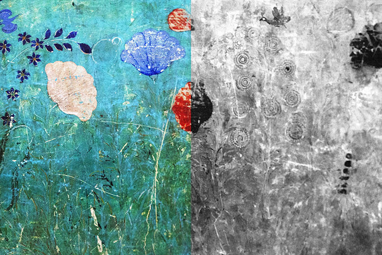
Digital photography is amazing, in that we have the option of shooting in color and switching to black and white in post-production. With film, this was at least a pain in the neck and at most, impossible. If you are unsure about an image, play around with it in Photoshop! Tools in Photoshop like the premade settings for black and white conversion are designed to give you a good set of variations to experiment with. If an image looks busy and over saturated, but you don’t want a full black and white conversion, try desaturating the image with the Vibrance adjustment layer or the Curves tool which are located in the Adjustment Layers panel.
Conclusion
Experimenting with color and black and white is fun, but no matter what option you do go with, be certain that you know why you chose that particular color scheme and make sure it adds to the sum of the image rather than detracting from it!
The post Top 6 Considerations to Help You Decide on Color or Black and White for Your Image by Megan Kennedy appeared first on Digital Photography School.